IncendiaryLemon
Captain Karen
Buzz201 said:Quite frankly as long as the artwork doesn't make me look like a paedophile (as Sentai seem hellbent on doing with some of their titles)
That's probably a little far...

Buzz201 said:Quite frankly as long as the artwork doesn't make me look like a paedophile (as Sentai seem hellbent on doing with some of their titles)
IncendiaryLemon said:Buzz201 said:Quite frankly as long as the artwork doesn't make me look like a paedophile (as Sentai seem hellbent on doing with some of their titles)
That's probably a little far...

If this is a design chouice, then perhaps they should've hired someone with actual design experience.Buzz201 said:and the unusual formatting sounds like a design choice to me.
No release I own from any other distributor has errors as egregious and noticeable as this. This stuff is inexcusable, regardless of the fact the later releases mostly fixed it. I don't understand how anybody could've looked at these inlays and thought this was acceptable to charge £20-30 for. I mean, look at this ****.Buzz201 said:And quite frankly, if you stopped buying a distributors releases because of mistakes on their packaging, I don't think you'd have any distributors left to buy from.
If it doesn't bother you that much, then fair enough, but IBuzz201 said:That's not an error, it's a design choice and not one that bothers me.
Nope.Buzz201 said:Really? Guess you didn't get SAO2 part 1 from Anime Limited which included a 720p DVD? or RWBY's English and Japanese 2.0 tracks? (RWBY's UK BD release occurred before the series received a Japanese dub.)
jeo said:I it doesn't bother you that much, then fair enough, but IBuzz201 said:That's not an error, it's a design choice and not one that bothers me.
don't understand how randomly changes the size and thickness of
the font in the middle of a sentence, and just aligning it really
haphazardly counts as a "design choice".


NormanicGrav said:If it helps:
[spoilerbutton]
[/spoilerbutton]
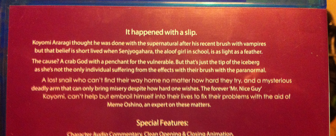
Bad, hastily taken phone photograph on my part. Probably would've just been easier to grab a shot off the internet... :|Buzz201 said:The first picture looks a completely different colour to me (it looks red)
jeo said:Bad, hastily taken phone photograph on my part. Probably would've just been easier to grab a shot off the internet... :|Buzz201 said:The first picture looks a completely different colour to me (it looks red)
")
jeo said:If it doesn't bother you that much, then fair enough, but I
don't understand how randomly changing the size and thickness of
the font in the middle of a sentence, and just aligning it really
haphazardly counts as a "design choice".
So why not just get that instead of an SE re-release? This is what baffles me most about Aniplex of America customers, half of them seem to be buying their products just for the sake of it...
Iluvatar said:So why not just get that instead of an SE re-release? This is what baffles me most about Aniplex of America customers, half of them seem to be buying their products just for the sake of it...
I’m not American but I buy the AoA releases
Why?
Because I do not want of a simple case/amaray without any bonus.
Because I want to have a clean artbox, even if the artbox is not rigid.
Because I want a booklet.
Because I want art-cards.
If I just want to see the shows, I go on Crunchyroll.
That's why I buy the AoA releases, even if they are much more expensive.
MVM = barebone/amaray release with nothing else.