Jon O Fun
Za Warudo
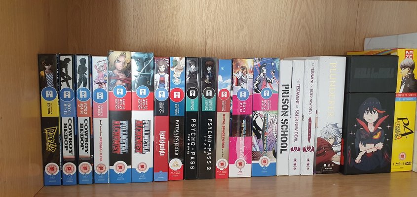
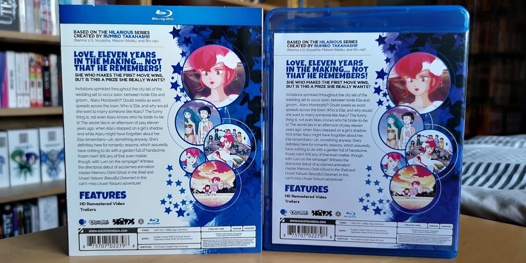
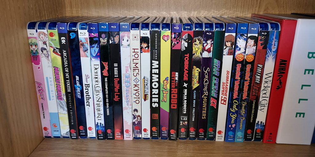
Ah yes the blue passport.Preaching to the choir there. That’s been a consistent complaint of mine for what, about fourteen years now? And apparently no-one responsible for cover design has yet seen fit to employ something like say, a template that keeps things like company logos and BBFC ratings the same size and in the same place.
Speaking of p*ss-poor graphic design, I recently received my new Tory blue passport. To say this was supposed to be the most British and patriotic crowning (and apparently only) achievement of brexit, this thing looks positively Soviet. Where my old burgundy booklet of subservience to our EU overlords had colourful scenes of British landscapes and nature on every page, this one just has the same washed-out geometric shapes. Where once there were seagulls, sailing boats and country cottages the only decoration adorning the pages of my new passport is my own miserable black-and-white gulag mugshot. I at least expected a laughing Nigel Farage watermark, perhaps a hologram that gives the bearer Boris Johnson’s hair or a little flip book of a barely moving queue of lorries at Dover. Instead, the hologram of one of the petals of the Welsh daffodil over my portrait just appears to give me a Hitler moustache in a certain light.
The most British and patriotic crowning achievement of brexit*
*produced in Poland by a French-Dutch company.

