You are using an out of date browser. It may not display this or other websites correctly.
You should upgrade or use an alternative browser.
You should upgrade or use an alternative browser.
What did you RECEIVE today? PHOTOS EDITION!
- Thread starter bakum4tsu
- Start date
Vincentdante
Chuunibyou
Mattrivers95
Student Council President
Received today from cdjapan proxy service
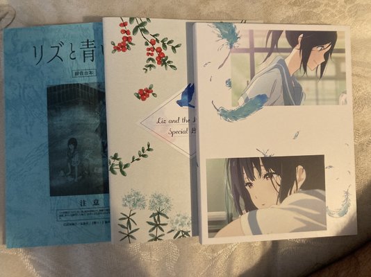
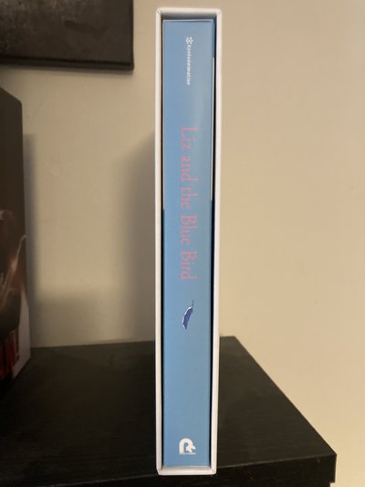
Liz and the bluebird (no English subs/dub) - I already have the pet slipcover version but i wanted a proper slip to match the JP eupho sets, I went with the Amazon version with an outer box just to be extra posh.
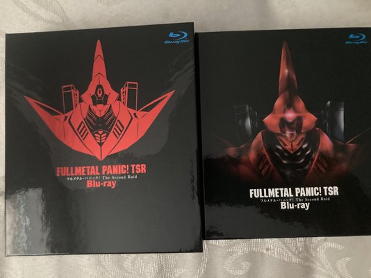
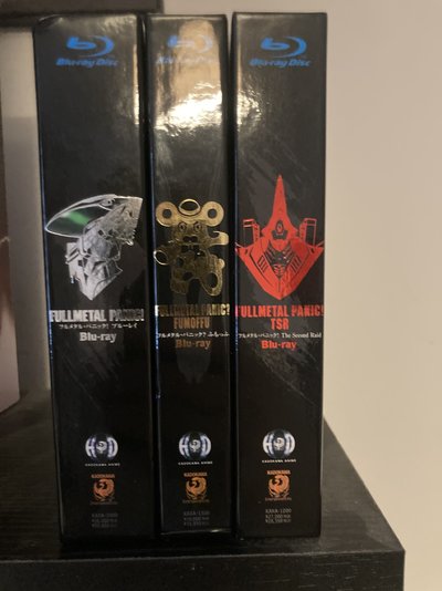
Full metal panic season 1-3 (English audio with forced JP subs) - these are a lot smaller than I was expecting, they’re square shaped rather than the usual size but I’m still happy with them at £30ish a pop.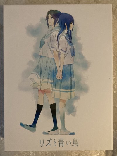


bigzgod
School Idol
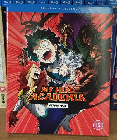
If it makes you feel any better, you never had consistency from the start! The age markings aren't aligned between Season 1 and Season 2 plus it's a different color/fill. Add in different font sizes for "My Hero Academia" and the Season boxes (which are also not aligned), it was a lost cause to begin with.The end of consistency
I understand your pain. Yen Press does the exact same crap with their manga/LNs.
Vincentdante
Chuunibyou
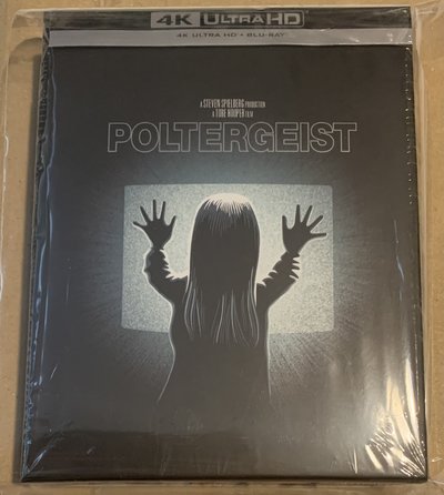
Wow, it wasn't just me then.Also recieved from Zavvi delivery purgatory which I ordered about 4wks agobetter late than never!
Geriatric hedgehog
Death Scythe
Loving the Liz set, it's beautiful. Shame there is no engrish at all in that otherwise I'd definitely have put an order in.Received today from cdjapan proxy service
Liz and the bluebird (no English subs/dub) - I already have the pet slipcover version but i wanted a proper slip to match the JP eupho sets, I went with the Amazon version with an outer box just to be extra posh.
Full metal panic season 1-3 (English audio with forced JP subs) - these are a lot smaller than I was expecting, they’re square shaped rather than the usual size but I’m still happy with them at £30ish a pop.View attachment 26152View attachment 26153View attachment 26162View attachment 26164View attachment 26161View attachment 26156View attachment 26157View attachment 26158View attachment 26159View attachment 26163
bigzgod
School Idol
Absolutely gorgeous set, the outer box looks amazing, just like the Amazon limited box for the 3rd movie. I've been on the fence about this myself, I might eventually get it but for now, it's hard to justify shelling out 14,000 yen for the Amazon version with the outer box.Received today from cdjapan proxy service
Liz and the bluebird (no English subs/dub) - I already have the pet slipcover version but i wanted a proper slip to match the JP eupho sets, I went with the Amazon version with an outer box just to be extra posh.
Jon O Fun
Za Warudo
Very true but with regards to a Manga/Funimation release different logo sizes and alignments are a given. Don't even look at the steelbooksIf it makes you feel any better, you never had consistency from the start! The age markings aren't aligned between Season 1 and Season 2 plus it's a different color/fill. Add in different font sizes for "My Hero Academia" and the Season boxes (which are also not aligned), it was a lost cause to begin with.
I understand your pain. Yen Press does the exact same crap with their manga/LNs.
I was referring to the MHA Season sets coming with slipcovers though
RadFemHedonist
Guild Member
Also recieved from Zavvi delivery purgatory which I ordered about 4wks agobetter late than never!
View attachment 26166

Also, is anyone gonna mention that in this image it's ordered "Season 1, Season 3, Season 2, Season 4"?
N-11
Student Council President
Also recieved from Zavvi delivery purgatory which I ordered about 4wks agobetter late than never!
View attachment 26166
This is one thing that bugs me to no end. How is it so hard for companies graphic design teams or people to keep consistency with releases. Its like they don't even put them on the shelf next to each other to see how it would look. Manga UK/Funimation are the worst offenders by far but MVM with there shifting bbfc logos from top to middle to bottom can't escape it either. For the most part AL is pretty consistent with their CEs and SEs but their SEs graphic design is straight up the ugliest design I have ever seen for Blu Rays. So for me theres no winning unless I make my own covers which I do for AL SEs.
Jon O Fun
Za Warudo
View attachment 26169
Also, is anyone gonna mention that in this image it's ordered "Season 1, Season 3, Season 2, Season 4"?
Jon O Fun
Za Warudo
100% agree, it pisses me off more when it's simply parts 1 & 2 of the same series! MVM I kinda cut some slack because they're a smaller company and just add their logo & BBFC to whatever art the US or AU put out.This is one thing that bugs me to no end. How is it so hard for companies graphic design teams or people to keep consistency with releases. Its like they don't even put them on the shelf next to each other to see how it would look. Manga UK/Funimation are the worst offenders by far but MVM with there shifting bbfc logos from top to middle to bottom can't escape it either. For the most part AL is pretty consistent with their CEs and SEs but their SEs graphic design is straight up the ugliest design I have ever seen for Blu Rays. So for me theres no winning unless I make my own covers which I do for AL SEs.
Disagree on AL CE consistency
Their SE's are what I'd call 'overdesigned' if that's even a word. They're designed to be consistent at the cost of aesthetic. I get why, AL want that brick and mortar shop placement and the normies to buy it.
Which is good in theory and I'm sure sounded good when they were drawing up plans originally but when you're years deep and got 100's of releases they all blend into one on the shop shelf and nothing differentiates them or makes them stand out...
I'd love to see your home made designs!
Myself I'm also no artist and also no photoshop expert, but if i was first thing I'd do is drop the film/season bar put that on the back it doesn't need to be on the spine.
Shrink the AL elephant by about 30 - 40%.
Drop the BBFC on the spine! you're a boutique label and not having it doesn't seem to hurt Arrow, Eureka, 88films in HMV, if anything they're thriving.
With that you've just freed up about 60% of you're average AL SE spine, use it to give the logo of the anime more room and the image at the top more breathing room
N-11
Student Council President
I will give MVM some slack since I think its only 2 people that work there and its probably easier to get artwork and covers approved if its just a copy of the already approved American version. For the AL CEs I have I think its pretty consistent but Konosuba sticks out.100% agree, it pisses me off more when it's simply parts 1 & 2 of the same series! MVM I kinda cut some slack because they're a smaller company and just add their logo & BBFC to whatever art the US or AU put out.
Disagree on AL CE consistencytheir CE spine design is like someone threw darts at a board overall.
Their SE's are what I'd call 'overdesigned' if that's even a word. They're designed to be consistent at the cost of aesthetic. I get why, AL want that brick and mortar shop placement and the normies to buy it.
Which is good in theory and I'm sure sounded good when they were drawing up plans originally but when you're years deep and got 100's of releases they all blend into one on the shop shelf and nothing differentiates them or makes them stand out...
I'd love to see your home made designs!
Myself I'm also no artist and also no photoshop expert, but if i was first thing I'd do is drop the film/season bar put that on the back it doesn't need to be on the spine.
Shrink the AL elephant by about 30 - 40%.
Drop the BBFC on the spine! you're a boutique label and not having it doesn't seem to hurt Arrow, Eureka, 88films in HMV, if anything they're thriving.
With that you've just freed up about 60% of you're average AL SE spine, use it to give the logo of the anime more room and the image at the top more breathing room
I have been debating making a thread in the creative section about my home made covers for awhile but just never got around to it, I would be more than happy to share the ones I have made so far. I could even show you what they look like in Blu Ray cases since I have replaced the old AL covers and I could give a tutorial on how to print them off as its quite simple.
Vincentdante
Chuunibyou
Custom covers are interesting and I tried dipping my toe in it once myself. If you had any suggestions for what paper you need for consitency with official covers I am all ears.I will give MVM some slack since I think its only 2 people that work there and its probably easier to get artwork and covers approved if its just a copy of the already approved American version. For the AL CEs I have I think its pretty consistent but Konosuba sticks out.
I have been debating making a thread in the creative section about my home made covers for awhile but just never got around to it, I would be more than happy to share the ones I have made so far. I could even show you what they look like in Blu Ray cases since I have replaced the old AL covers and I could give a tutorial on how to print them off as its quite simple.
Jon O Fun
Za Warudo
I'm gonna guess you're pretty new to the world of AL. I will fully give it to them, yes they are pretty consistent now. Now being the last 2 years but oh boy before that did they go all out on seeing what stuck.For the AL CEs I have I think its pretty consistent but Konosuba sticks out.
Their first CE's were just rigid cases with the SE type spine then after a year or 2 they put out a Baccano CE clean box, clean spine, just the logo. Jobs done you've nailed it just keep doing that.... nope.
They continued to do the rigid case SE spine but also threw in top load rigid case SE spine but only the top part of the spine, the BBFC was on a bellybar (Space Dandy s1)
Top load rigid case with blank spine and SE spine on O-Card (Space Dandy s2)
Rigid case with SE spine and O-Card with SE spine (Royal Space Force)
Rigid case blank spine and O-Card with SE spine (Patama Inverted)
+ Others I'm sure but most my collection is packed away atm.
Point is they pretty much had the winning design with Baccano that they seem to have adopted for 99% of their releases now with the odd one that slips through with the SE spine (Psycho Pass: SotS, Castlevania s2) which I'm guessing is to match the previous release?
So lord only knows why they decided to mix and match the other designs for years before thinking yup we had it right already
Girls with Guns
Claymore
This arrived today from Zavvi. Thankfully the BBFC stickers were removable but be careful with removing the info sheet as the glue is very stubborn.
I guess I'll be cursed into eternity with the info sheets on all of AL's Collector Edition sets... Because I can't find plastic box protectors to fit those size sets, I don't remove the shrink wrap from them, but instead cut "door flaps" in the wrap on the open side of the boxes with a razor blade to get the internals out, in order to protect the boxes from shelf wear. So, I haven't been able to remove any of the info sheets from the back of the chipboard boxes. The glue dots on the older sets must be like cured epoxy by now, ne'er to be removable, lol.
Vincentdante
Chuunibyou
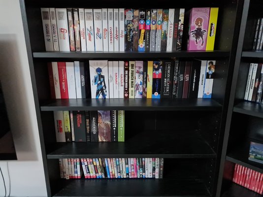
Most of my collection is Baccanno style with a few showing the logo, I think the early days had the mentioned issues but I would say most of AL (at least what I own) is pretty consistant. (ignore the gaps, I lent a few shows to my brother)+ Others I'm sure but most my collection is packed away atm.
ayase
State Alchemist
Preaching to the choir there. That’s been a consistent complaint of mine for what, about fourteen years now? And apparently no-one responsible for cover design has yet seen fit to employ something like say, a template that keeps things like company logos and BBFC ratings the same size and in the same place.How is it so hard for companies graphic design teams or people to keep consistency with releases.
Speaking of p*ss-poor graphic design, I recently received my new Tory blue passport. To say this was supposed to be the most British and patriotic crowning (and apparently only) achievement of brexit, this thing looks positively Soviet. Where my old burgundy booklet of subservience to our EU overlords had colourful scenes of British landscapes and nature on every page, this one just has the same washed-out geometric shapes. Where once there were seagulls, sailing boats and country cottages the only decoration adorning the pages of my new passport is my own miserable black-and-white gulag mugshot. I at least expected a laughing Nigel Farage watermark, perhaps a hologram that gives the bearer Boris Johnson’s hair or a little flip book of a barely moving queue of lorries at Dover. Instead, the hologram of one of the petals of the Welsh daffodil over my portrait just appears to give me a Hitler moustache in a certain light.


