You are using an out of date browser. It may not display this or other websites correctly.
You should upgrade or use an alternative browser.
You should upgrade or use an alternative browser.
Upcoming UK Anime DVD Artwork!
- Thread starter Neferpitou
- Start date
- Status
- Not open for further replies.
Animefreak17
Godhand
Cool
Rosencrantz
Dragon Knight
Hmm, why do they feel the need to list each episode title on the back, kinda odd, unless it's a reversible cover?
Shiroi Hane
Dragon Knight
They've put the Bakemonogatari Part 1 DVD barcode on there as a placeholder for some reason.
Rosencrantz
Dragon Knight
Dannielle said:
Nice. Looking back through this thread I've found the complete box set art, but word was set 1 had it own art, can't seem to see that anywhere.
Dan
Stand User
Lawrence said:Seems like a step back after the place holder piece. I mean, it doesn't look bad but it doesn't really sell the show either.
Agreed. I wasn't completely sold on the last one but this one is just a strange choice IMO.
Edit: wondering if that announcement is a box for the sets that will have the other artwork
Rosencrantz
Dragon Knight
Lawrence said:Seems like a step back after the place holder piece. I mean, it doesn't look bad but it doesn't really sell the show either.
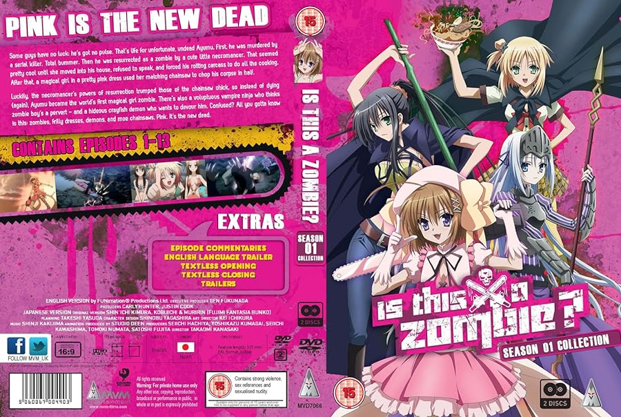
Agreed, I don't know why on earth they wouldn't just automatically use the great artwork the Funimation sets had. Seriously why design a new cover?
ilmaestro
State Alchemist
It's the cover art from volume 1 of the JP release. I personally approve.Rosencrantz said:Seriously why design a new cover?
Rosencrantz
Dragon Knight
Dannielle said:From browsing through MangaUK's twitter, it looks like they weren't allowed to use the original art they put up.
I like that new art though
Shame about that then, the new ones a nice enough picture but it doesn't leap out as an awesome cover
robot monkey
Hunter
Like the art for the Iria release, not too busy design wise.
http://www.amazon.co.uk/Iria-Collection ... words=iria
http://www.amazon.co.uk/Iria-Collection ... words=iria
Mangaranga
Za Warudo
That cover is unsurprisingly dreadful. I really do not like it one bit.
MVM have also lost a sale since it's a PAL conversion. NTSC/BD would have been a sale.
MVM have also lost a sale since it's a PAL conversion. NTSC/BD would have been a sale.
fabio de lunatico
The Wildcard
I like the front and back cover but the spine is a mess, all logos and square boxes.
Pre-ordered because it's half the price of the Funi DVD set, and I can live with PAL speedup.
Pre-ordered because it's half the price of the Funi DVD set, and I can live with PAL speedup.
- Status
- Not open for further replies.


