I'm curious! So I'll just ask.
Packaging artwork for Hyouka Part 2 seems to have emerged. Is that already the final thing?
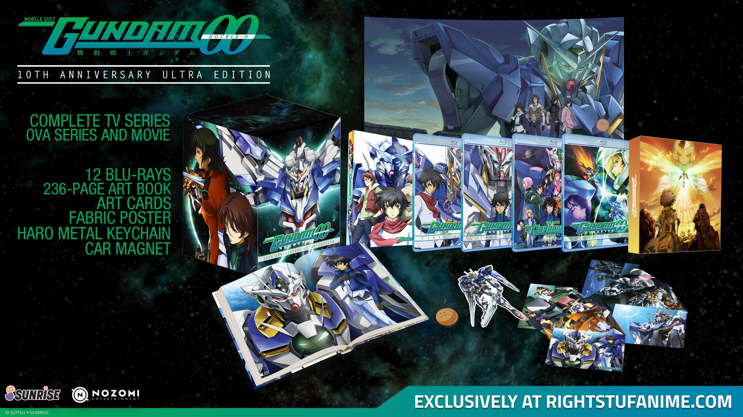
If yes, I'd be really curious about the design choice. Not that it looks bad or anything, but its design looks much more like the outer box holding both parts as opposed the the rigid case of part one that fits into it. (Which had the same images as the first Japanese BD artbox.)
The lack of continuity looked a bit weird somehow.
(And just so every so slightly a bit disappointed that the booklet cover is to white and empty. But I guess that's the general design with all that much white to blame for.Still hoping for an assembly of the Japanese DVD release/box artwork to be in the booklet.*cough*)
Just a case of what worked with assets available for the second part for us - I'm also not the biggest fan of two images separated by a spine for example so instead of repeating mistakes a course-correction worked for me there given a squeeze on assets for covers. Could have replicated the standard edition but it'd have been a bit weiiiird.
Cover of booklet is in keeping with Japanese homevideo edition - to do something different could have placed it in approval hell and frankly did not want to delay the show anymore than is necessary!
Re an assembly of box artwork - combined with the pinch, doing artcards in Part 1 and the sheer VOLUME of data in the booklets from Japan - it wasn't possible within the 84 pages to do a gallery. Instead you have a huge volume of character and setting information instead, don't think anyone's gone that far for this show elsewhere!
AP


