Zin5ki
Railgun
Boo!I don't like Shinkai's film at all, but....
Boo to you!
I invite others to partake in my act of vituperation.
EDIT: Children who Chase Lost Voices is an exception. That was a woeful miscue.
Boo!I don't like Shinkai's film at all, but....
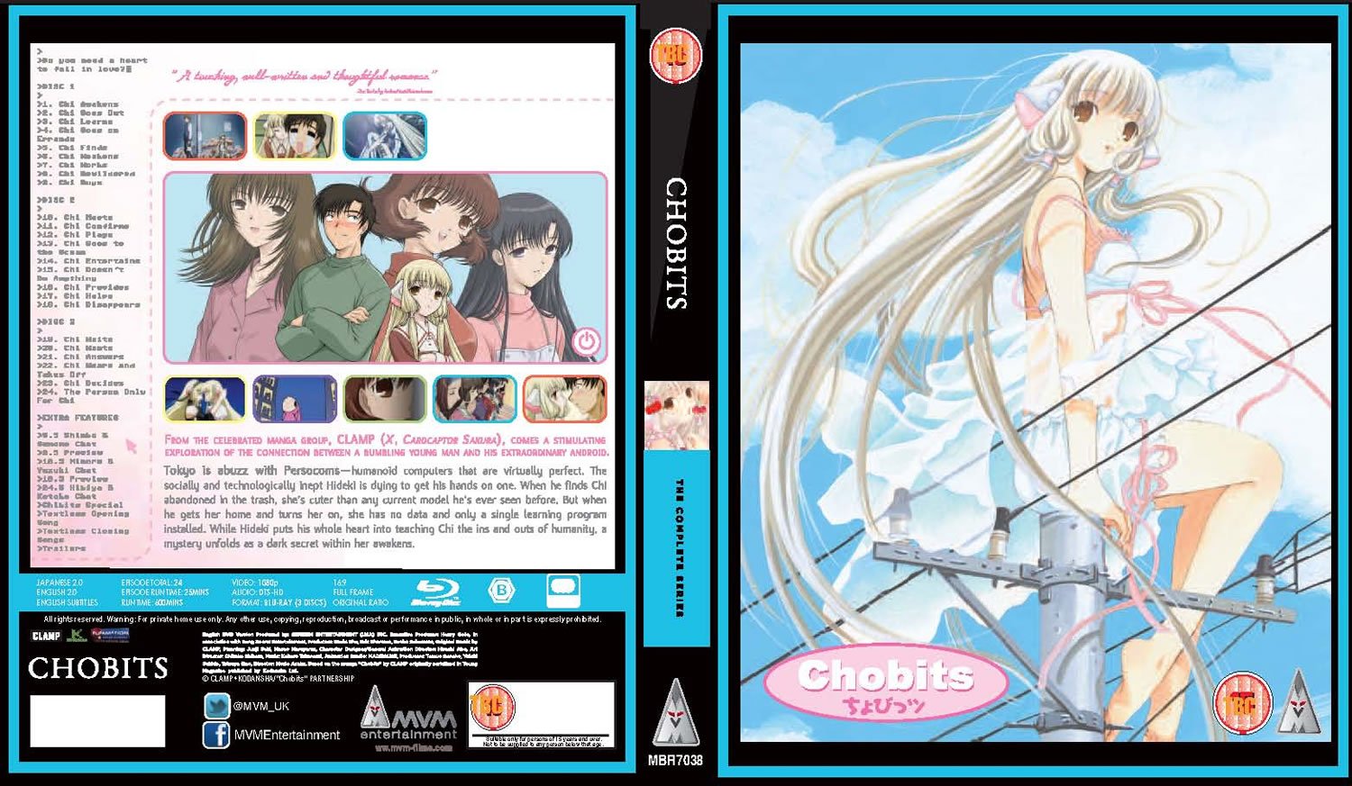
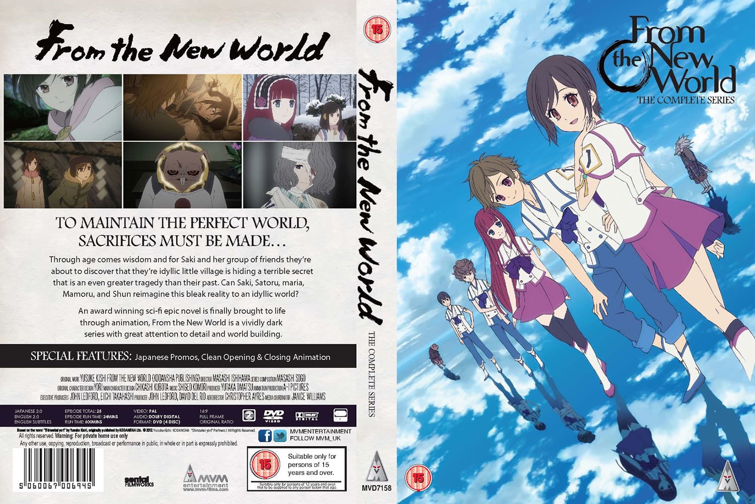
Wow, that ugly spine again.
I don't really get how Chobits copying the US artwork is an issue at all...
I hope that Chobits artwork is just a placeholder. It looks like something a 12-year-old "photoshoped" in MS Paint. The images aren't even properly sized and aligned...
Man, if that's the legit Chobits cover then that's shocking. With the best will in the world, MVM cover art has been pretty ropey on occasion, but I have to admit this one takes it to a new low.
Wow... MVM not even attempting to change funi's 'Anime Classics' cover for Chobits is possibly the laziest artwork I've ever seen!
Here, I made the Lain boxart to save everybody time. Paypal me pls.
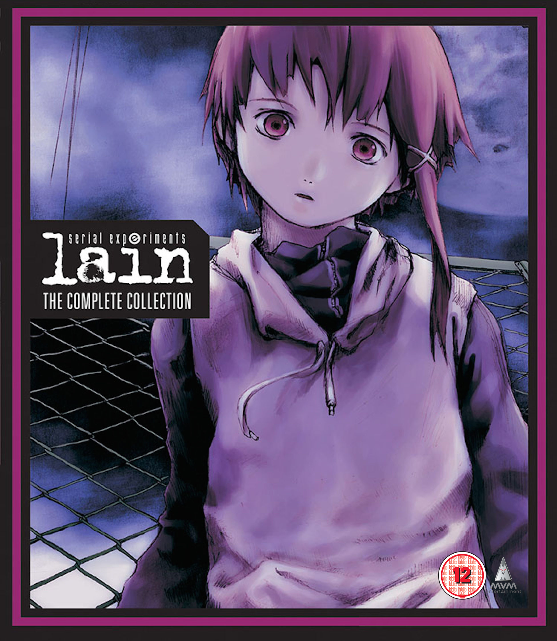
Here, I made the Lain boxart to save everybody time. Paypal me pls.

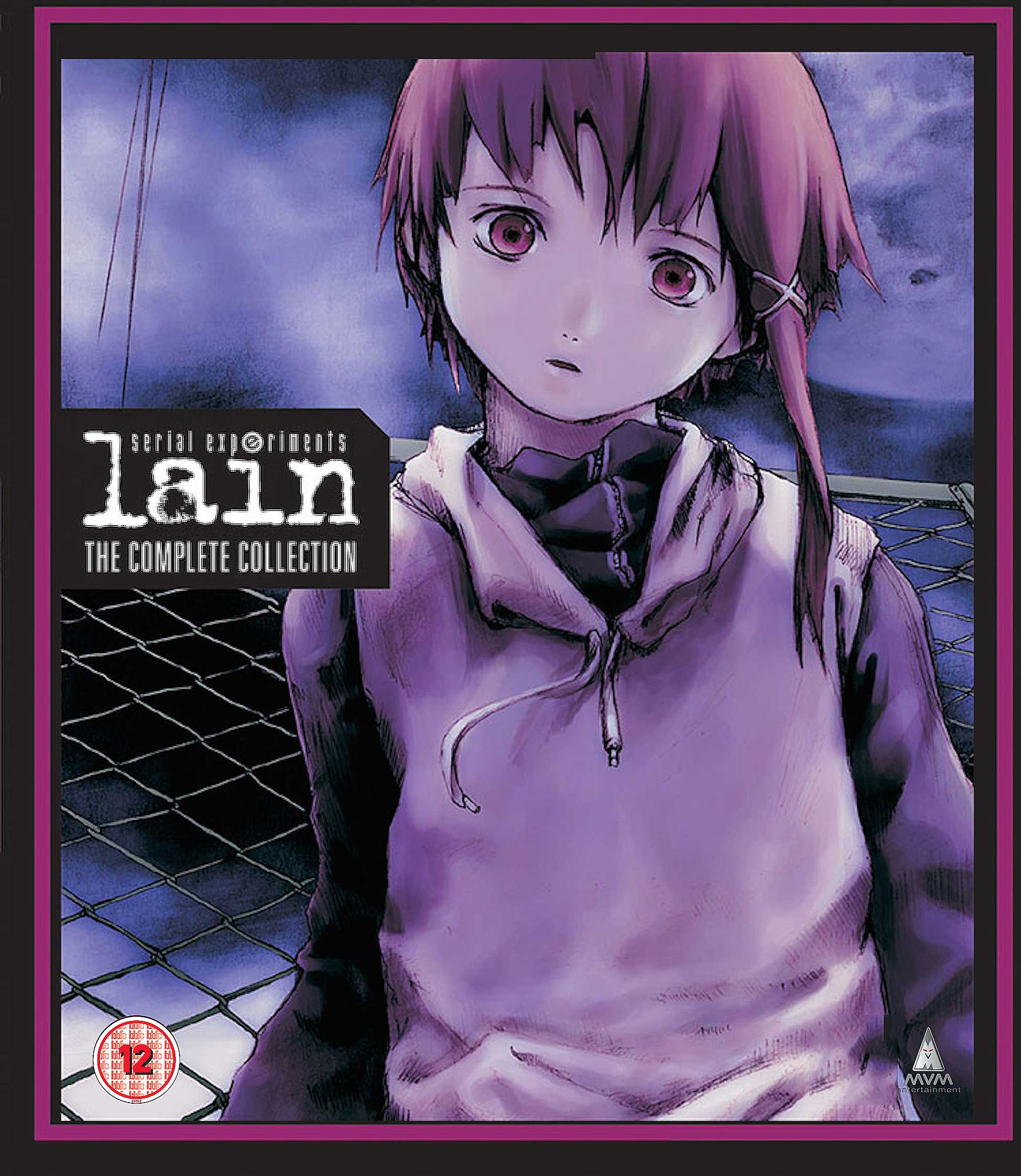
Don't quote me on this as the only anime classics titles I have are Ai Yori Aoshi & Love Hina but they both have reversible clean front covers (without the banner) still has the spine though.Haven't MVM always just used the artwork of another foreign licensor, sans their branding, because it's a lot easier to pass through approvals? This is perhaps most noticeable when you compare the spines of MVM's releases, which are really mismatched as opposed to Manga and Anime Limited's, who have their own uniform styles.
While usually not an issue, I have to agree that in this instance, replicating Funimation's design (with slight alterations) hasn't worked out so well. Also, do we know if their release will have an outer slipcover or box, or just be a sleeve in an amaray? Because it will look even worse as an amaray...
In fact, looking at it - isn't the blue border on the front taller than the one on the back? :/
Veritable fighting words!His movies are garbage the people masturbate over because muh animation looks realistic.
