The Red Turtle: Review (2016, Film)
It’s rare to see a film that both respects and trust the audience, a film devoid of exposition or a big grandiose plot, like the protagonist of the film itself,
The Red Turtle exists in isolation, daring to swim against the tides and in doing so drifts to the upper echelon of animated films.
The Red Turtle, a silent masterpiece that within its silence has more to say than its contemporaries.
The first
Studio Ghibli co-production, beckoned by the familiar but slightly different splash screen at the start of the film, this time the ever so lovable woodland spirit shrouded in a red background instead of the blue one that we’ve all become accustomed to over the last 30 years, still serving the same purpose as it had in the past, signalling the kind of film that the audience is in for, a film that is beautiful to look at, captivating to listen to, one that is delicate in its depictions of nature and appreciative of every second that the audience spends with it. Indeed
The Red Turtle is a gorgeous film in more ways than one and this hand drawn wonder dazzles from the very first frame. It’s instantly recognizable that
The Red Turtle looks a little different to the in-house
Ghibli films of old, from the characters beady eyes to even the way in which the characters move, which makes sense since the characters in
The Red Turtle are CG models which affords them with more nuanced and intricate movements. As weird as it may sound,
The Red Turtles European roots are instantaneously apparent at first glance. Everything within this hand drawn/CG hybrid film looks detailed in ways the standard
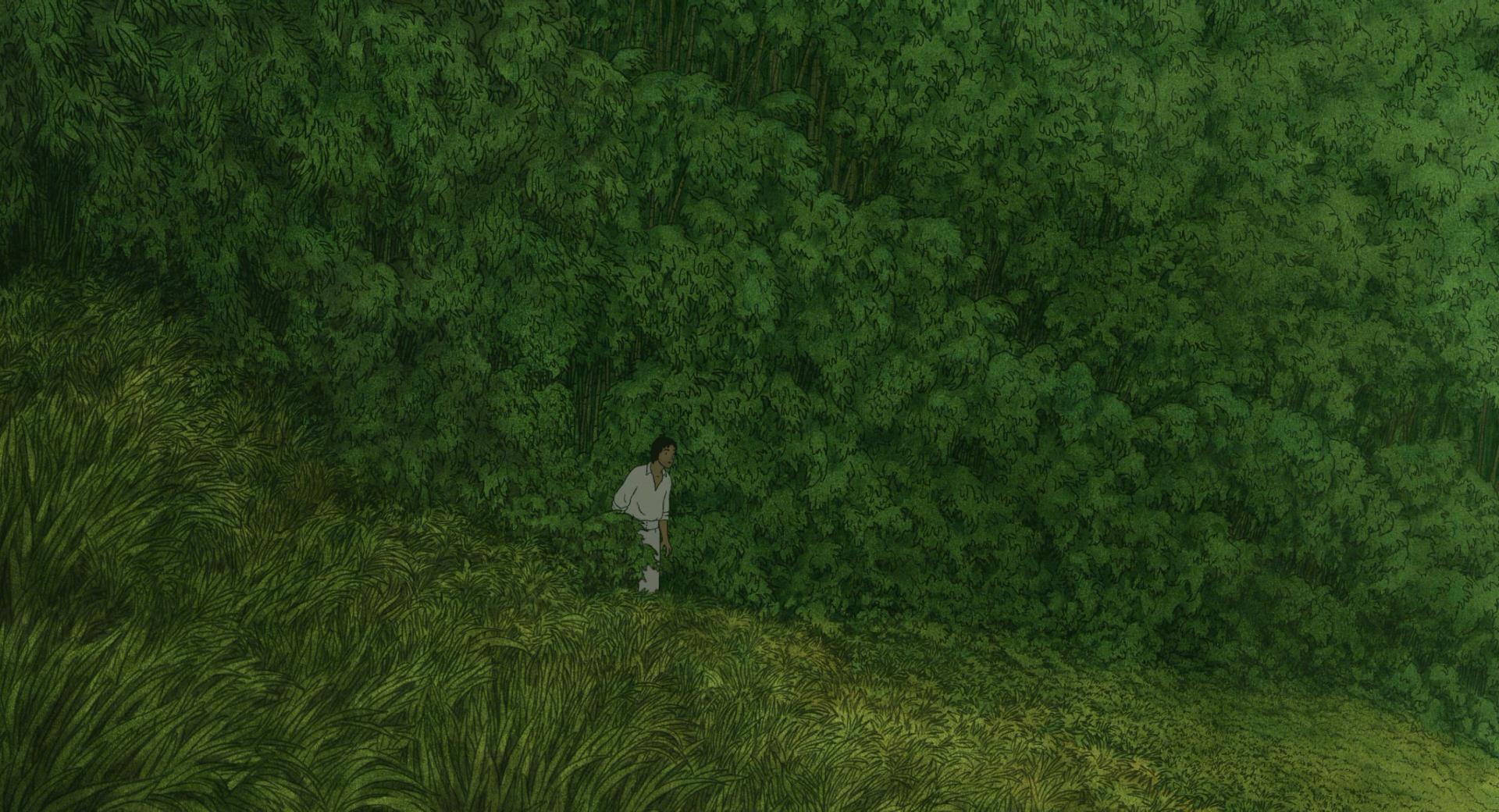
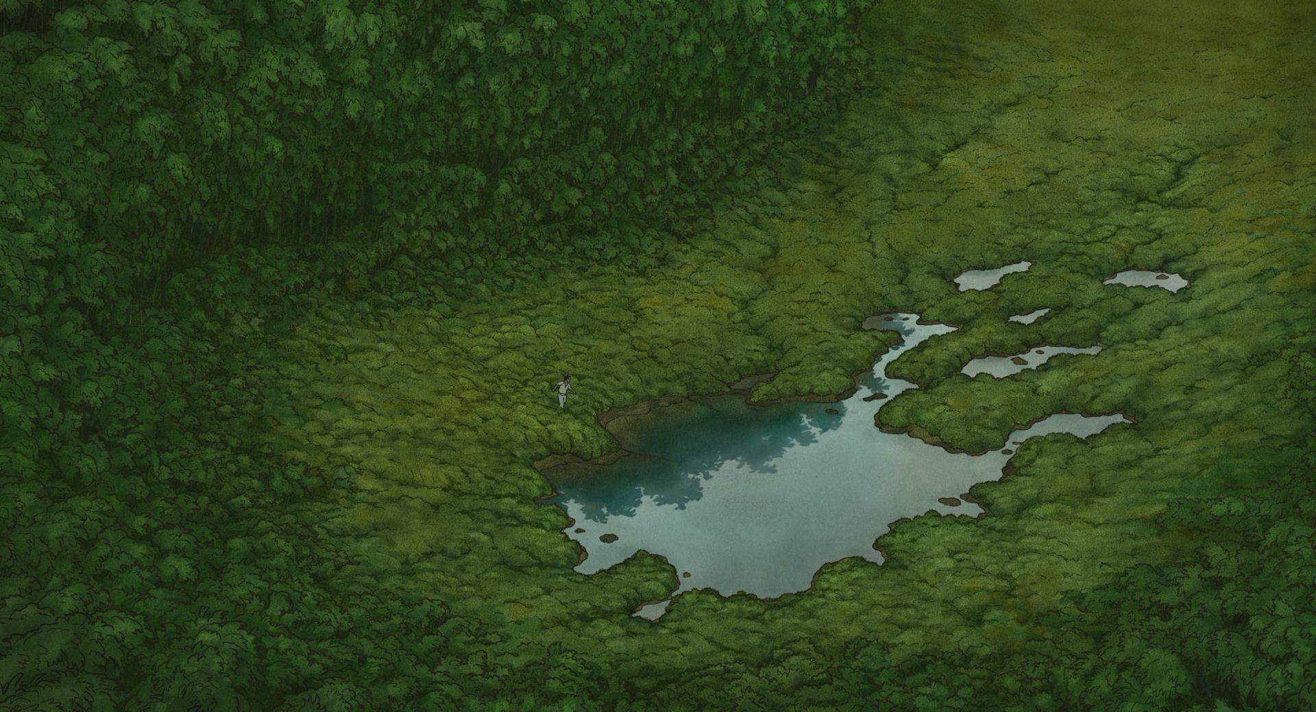
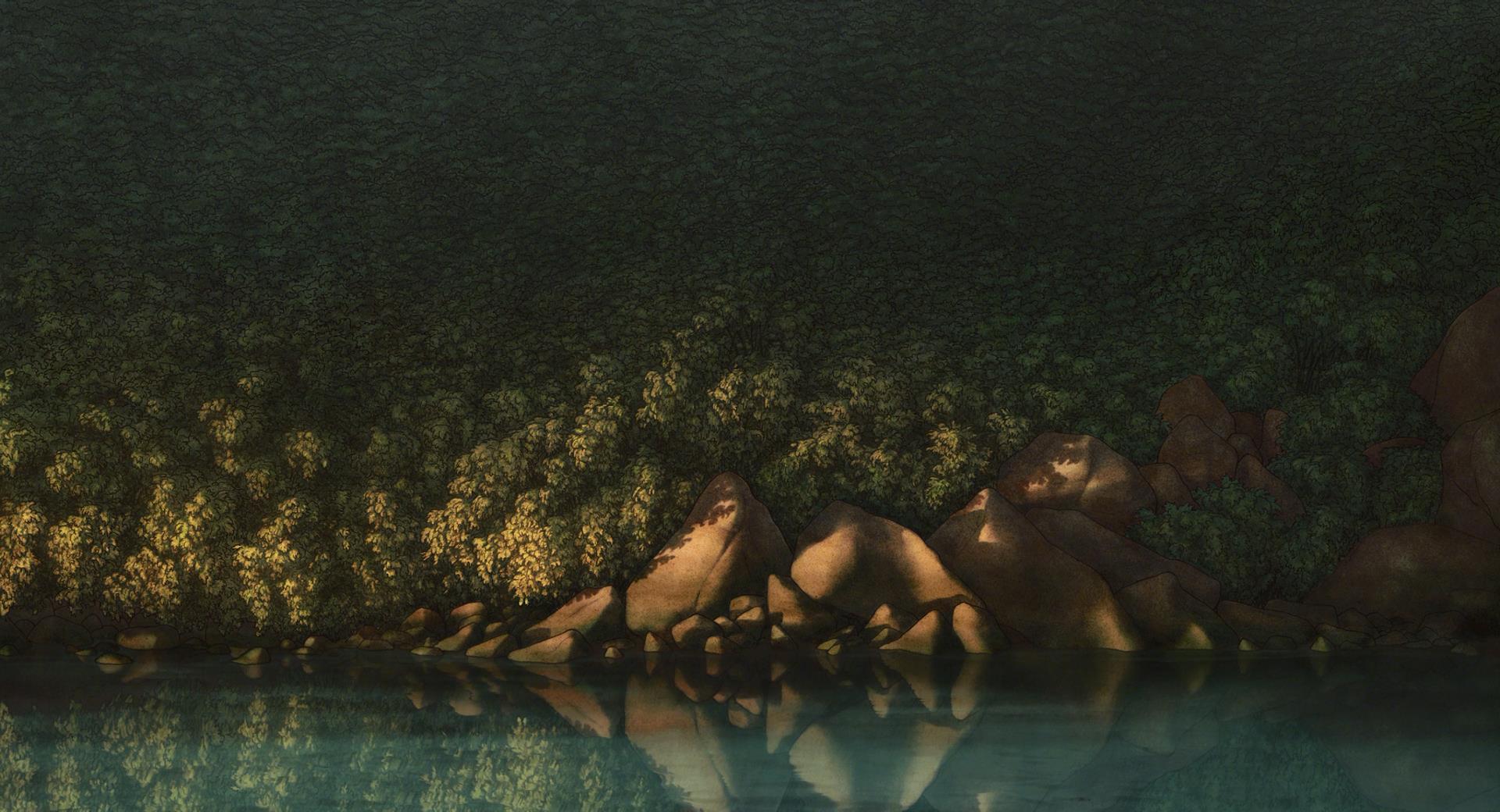
Ghibli film doesn’t, representing a more true to life take on its visuals, be it the ever changing clouds in the sky or the foliage that decorates the island. At the same time, what I noticed was a remarkable level or restraint being demonstrated with the visuals and cinematography and what I mean by this is the fact that every frame displays the bare necessities in order to create a sense of place whilst still feeling both palpable and real.
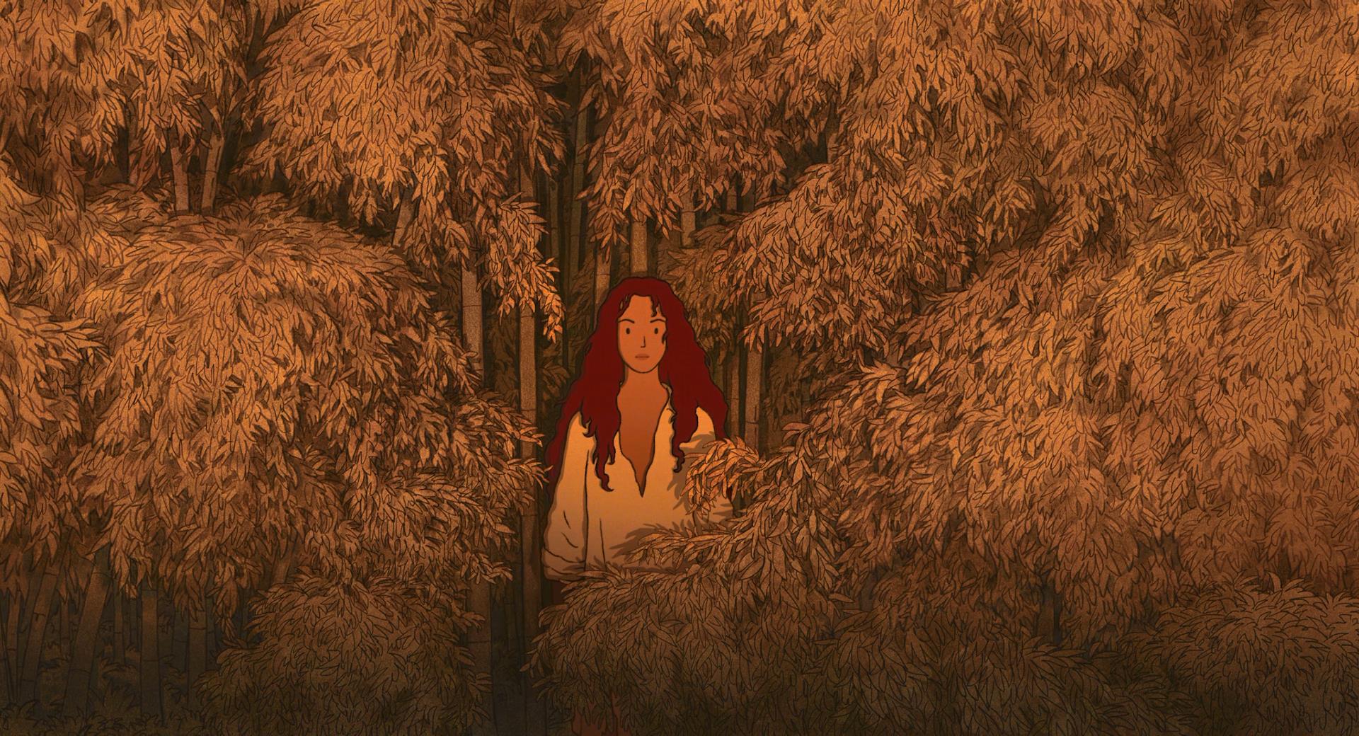
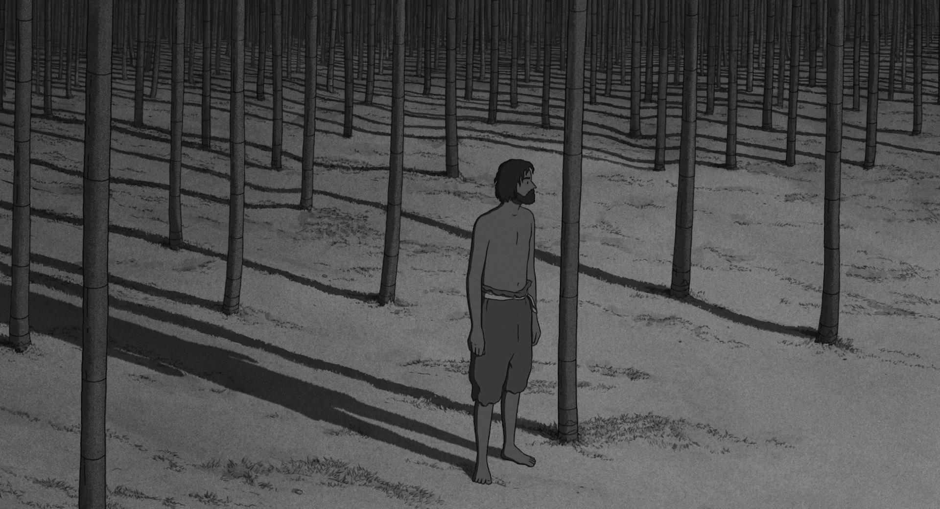
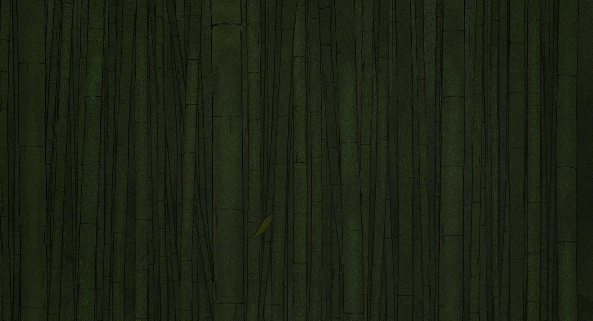
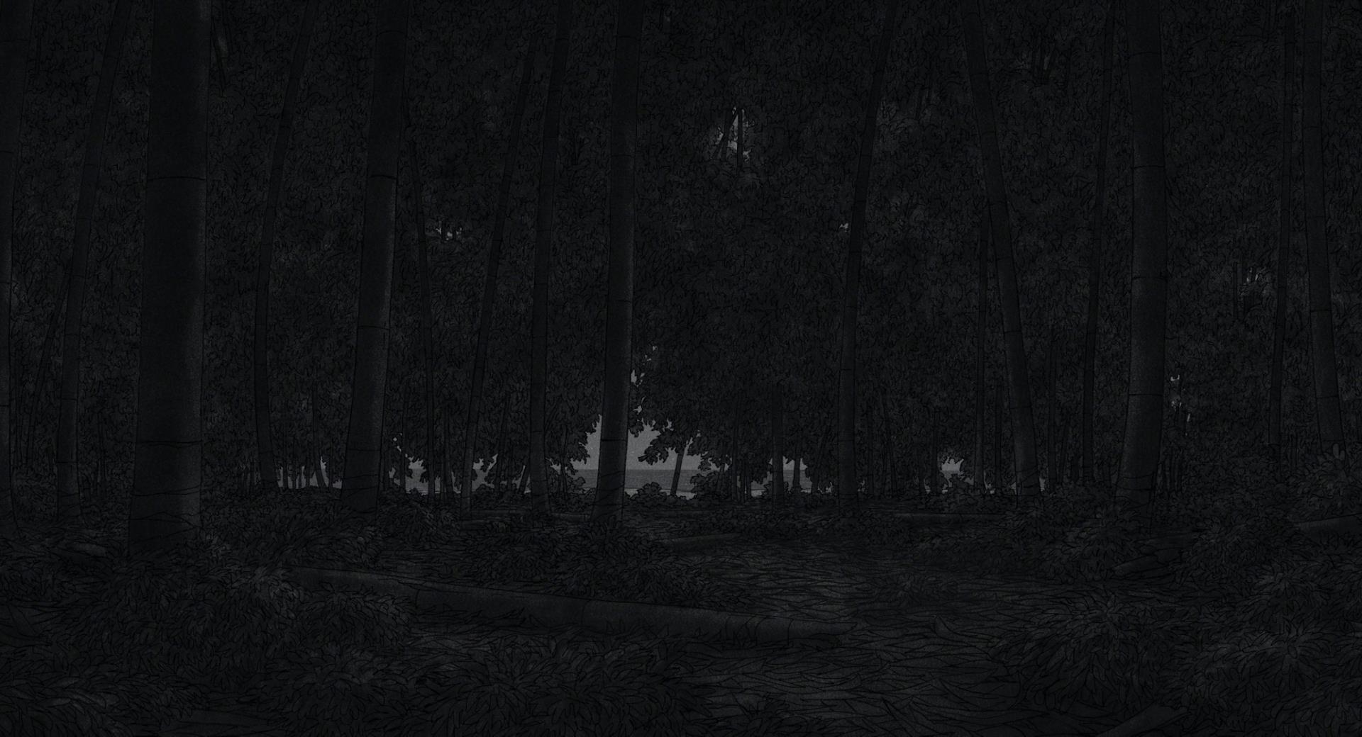
The forest is detailed with foliage for example, but only one type of vegetation at a time, such as bamboo. The framing and composition within
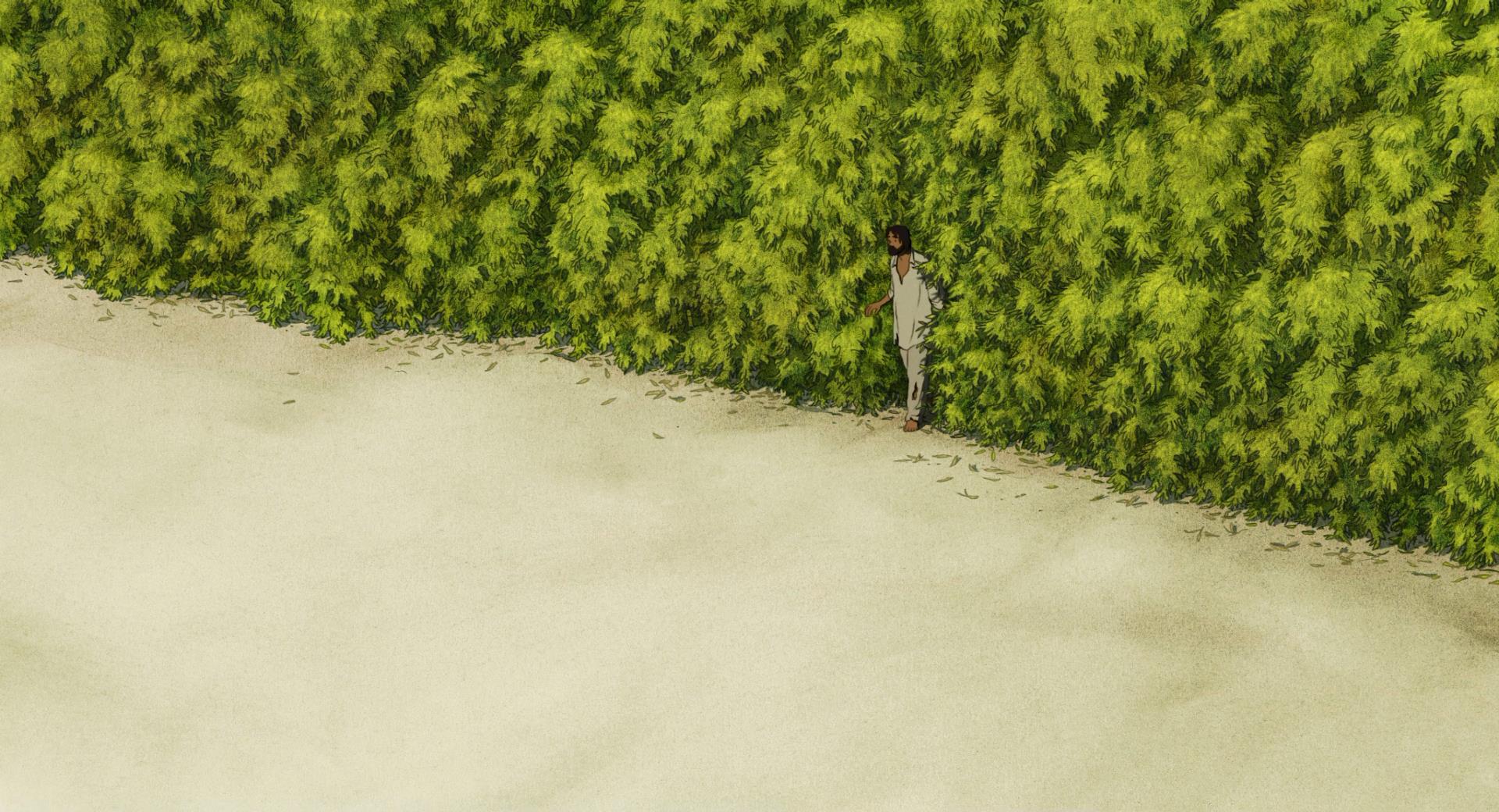
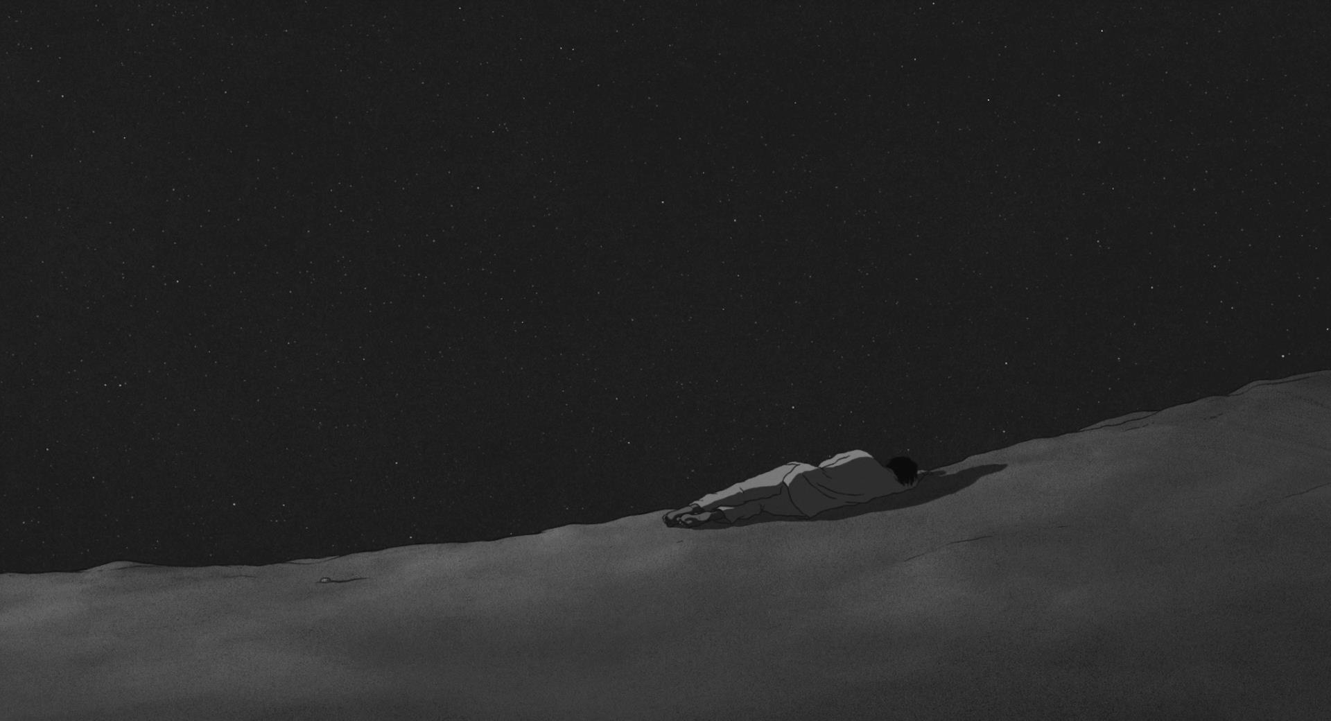
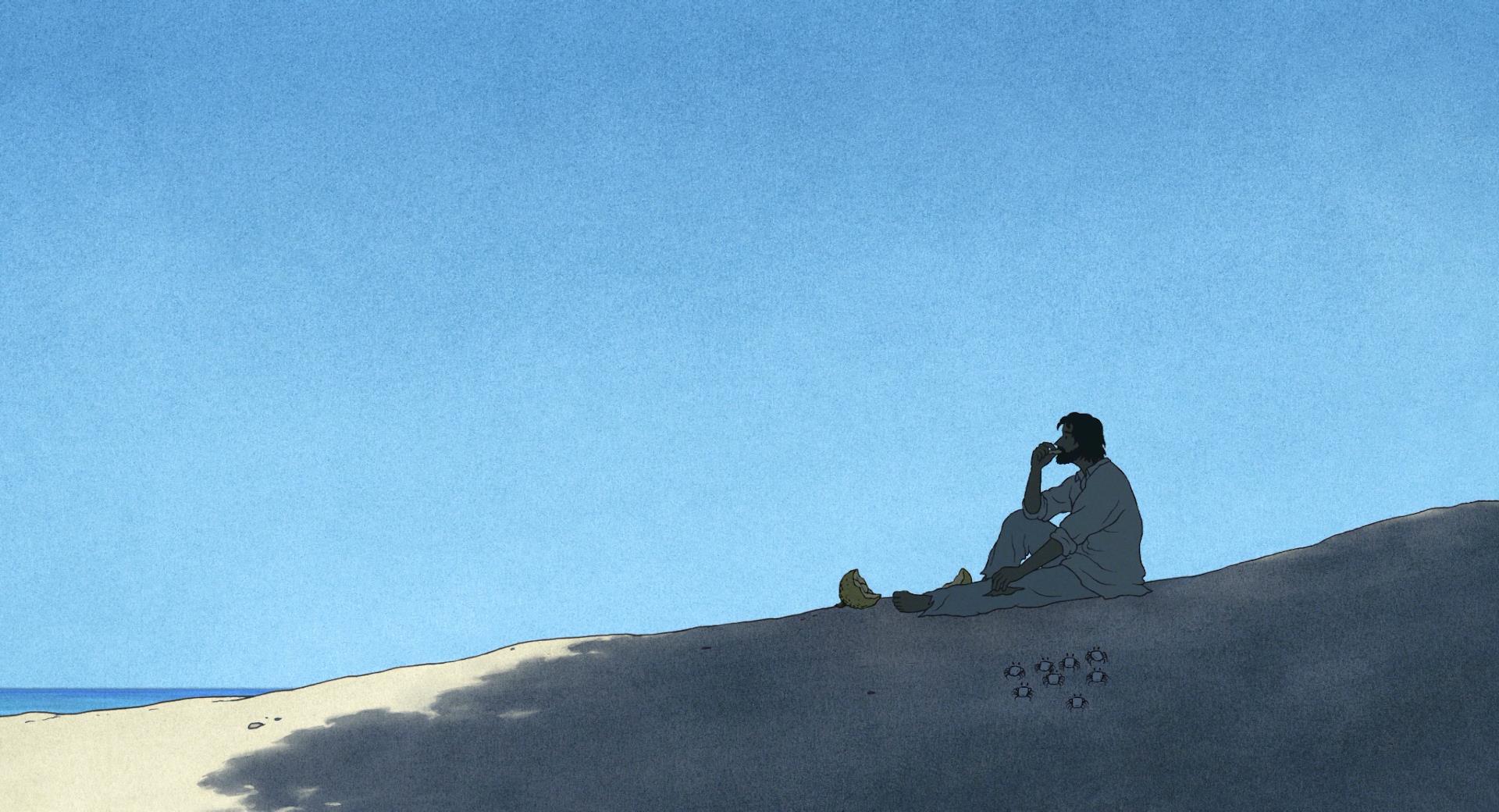
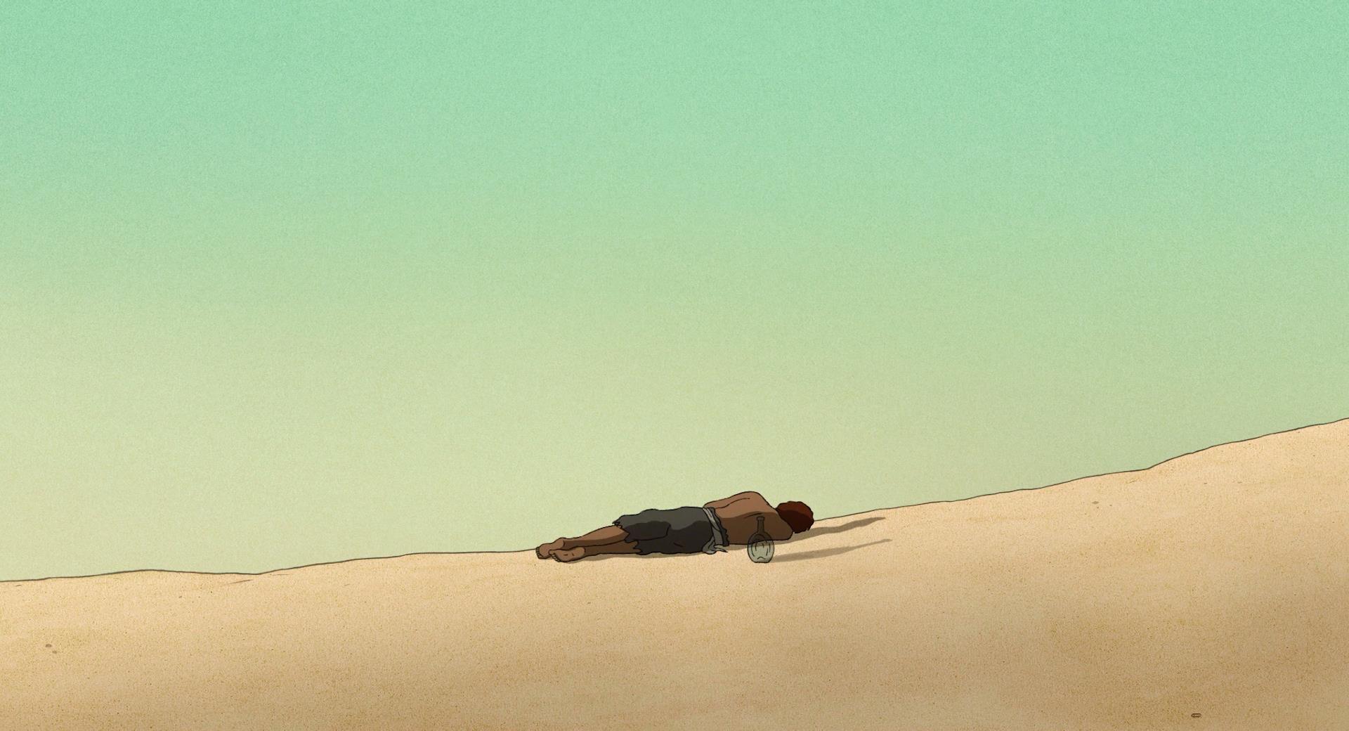
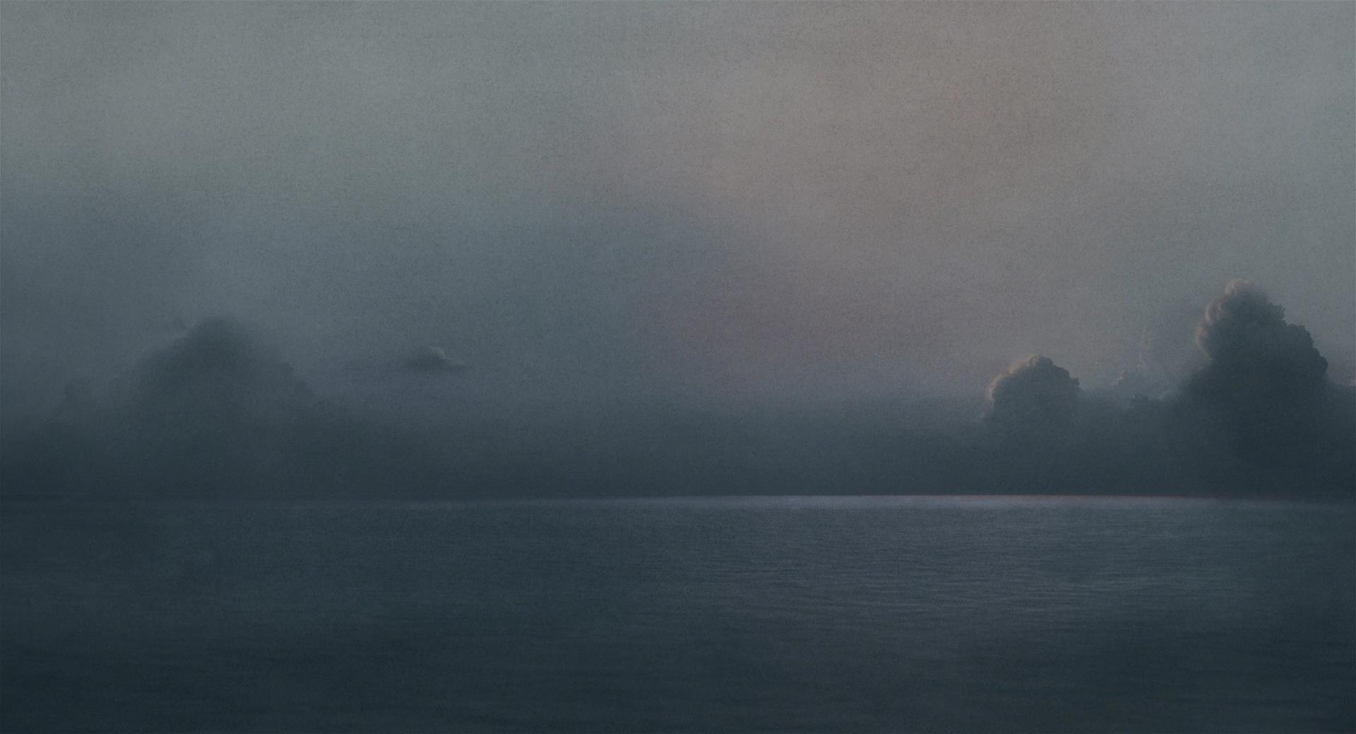
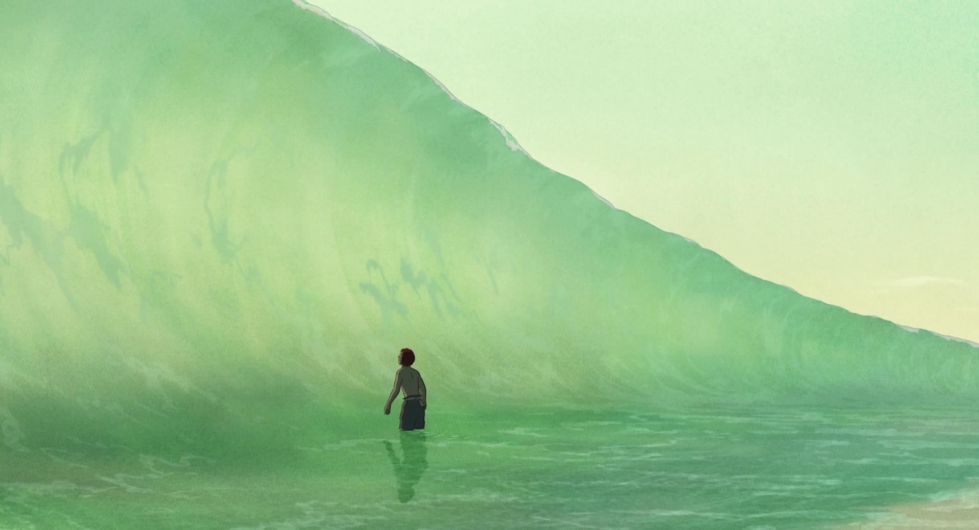
The Red Turtle is minimalist in approach, often exaggerating and focusing on the huge blue sky, the grainy sand, the ocean and the horizon on which the two meet in the far, unreachable distance. The juxtaposition of the detailed leaves and foliage and the plainness and flatness of many scenes conjure up a sense of simplicity that is often not felt in animated films. It’s a delicate line to walk but the two complement each other effortlessly here. Simplicity is a fantastic descriptor of
The Red Turtle, but simple doesn’t mean devoid of any depth or nuance.
What makes this film special is the lack of dialogue and this matched with the lack of nuanced facial expressions brings forth an interesting proposition.
The Red Turtle is a tightly knit, efficient film, one devoid of distractions and the lack of voice acting plays into this. A criticism that I have noticed from people in regards to this film is the observation that this film lacks real drama and thus any real motivation to care about its cast or its world. What’s interesting about
The Red Turtle, and what surprised me about my experience with it was the fact that, indeed this film is one that lacks tension or any real crescendo, something that I didn’t expect going in. Although people’s opinion on this will differ from person to person I would hesitate to call it a negative trait, because although I can understand just why this may not resonate with many audiences, it may be the strongest aspect of this film for me.
The Red Turtle is not a film about survival like many other films surrounding a castaway, from the offset it becomes apparent that the main character in this film is self-sufficient and able to survive on the island. The audience quickly discovers how he catches his food, where he sleeps and finds shelter, and so what you have instead is a film about a man’s relationship with nature and when you look at
The Red Turtle from this angle you quickly begin to understand how it fits into the
Studio Ghibli catalogue. While watching
The Red Turtle, I felt as if I was observing a person rather than watching a movie, not much really happens and yet I felt captivated, unable to draw my eyes away from the screen. A vast majority of
The Red Turtle is depicted at a distance which supplements the notion of this being a film in which you observe nature.
The Red Turtle is a film that chooses not to speak directly to the audience both figuratively and literally as Director
Michaël Dudok de Wit builds a sandbox and allows the main character to roam and interact with the very nature that surrounds him. Events take place within this film that conjure up a sense of tension however I found that these scenes played out in ways that yet again are intended to be passively observed rather that encouraging active participation from the audience. For 80 minutes, like the main character himself you find yourself stranded on an island, devoid of distractions, instead absorbing everything.
By spending a vast majority of the run-time observing the island, it too becomes a character, ever changing and evolving.
The Red Turtle very much like every
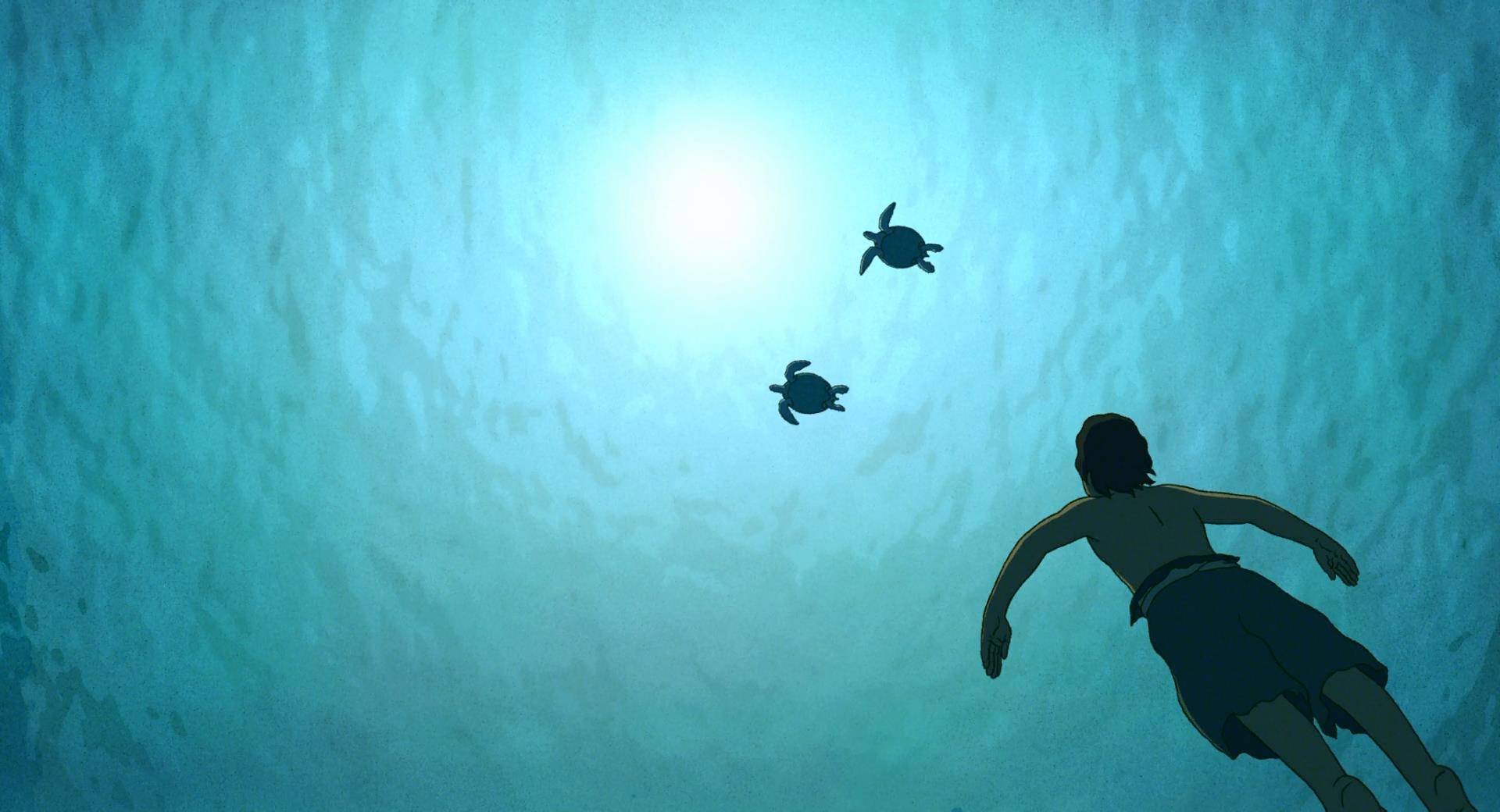
Ghibli film that precedes it is without a doubt a film about nature and man’s relationship with it and so treating the island with the same level of respect that graces the main protagonist is fitting and appropriate. The level of detail applied to the chiaroscuro of the island for one is admirable with efforts placed to even the minutest of shadows that decorate the island. Lighting and shadows play a key role in allowing the viewer to gain bearing on the many characteristics that define the island, for example due to the way that the sea is animated in
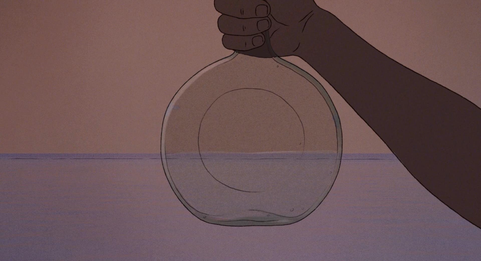
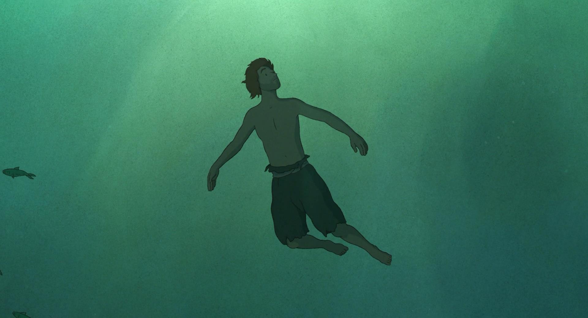
The Red Turtle the depth and clarity of the water can sometimes only be inferred by the shadows that the floating objects cast onto the sea bed. Similarly the state of the water and its calmness is often defined by the reflections cast onto it. Like within
de Wit’s previous shorts he utilities shadows and lighting in order to define the weather and the time of day by playing with the contrast, width and length of the shadows that are cast onto the environment and so as
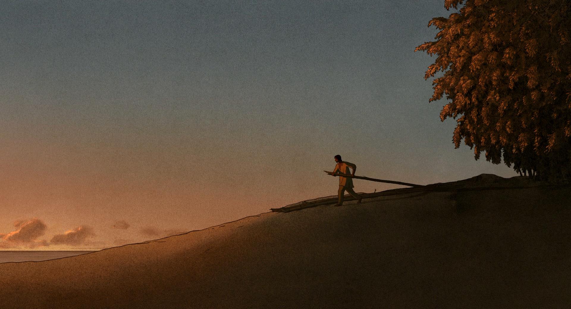
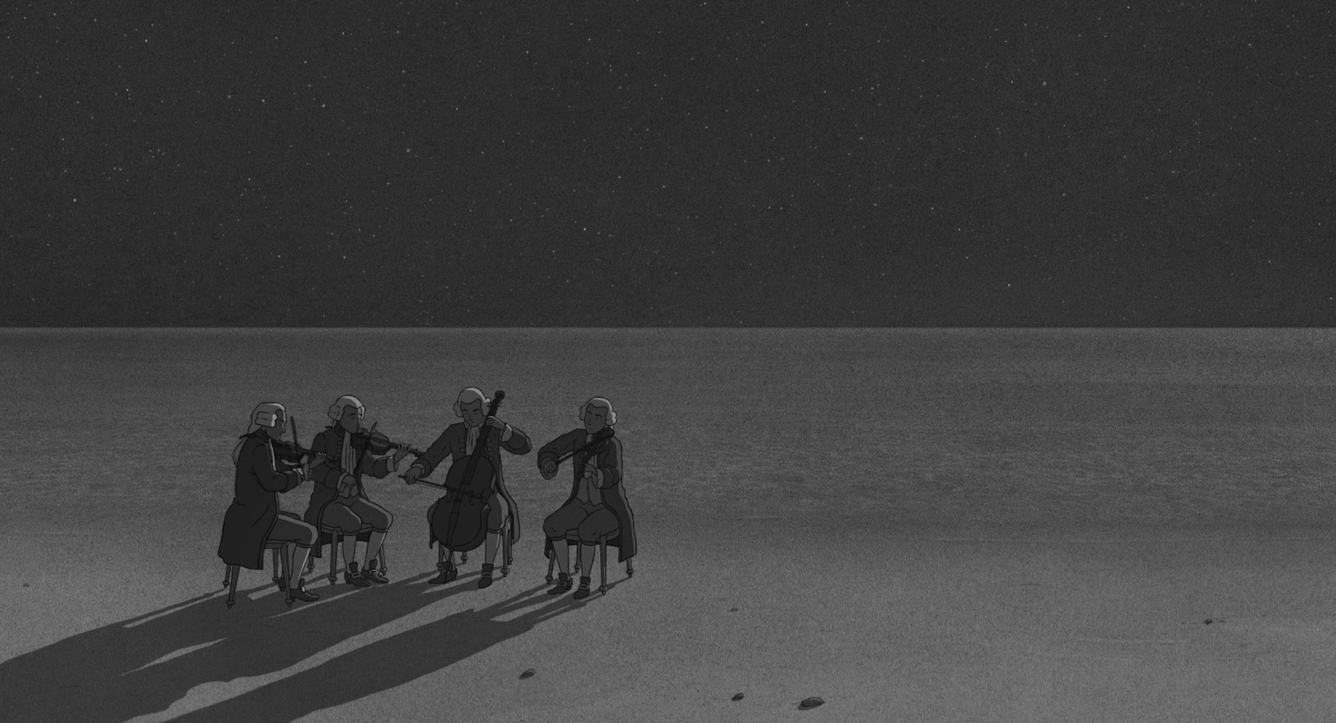
The Red Turtle progresses these conditions change naturally thanks to the carefully considered natural color pallets used which adapt handily to the changing surroundings, from the vibrant stretches of day to the grey nights. These variations of lighting that embellish the sky as days turn into nights make for incredible scenes that are haunting in their beauty and striking in their simplicity.
What I noticed a lot while admiring the visuals for
The Red Turtle was the fact that even at its most static, during the quiet moments, everything still has motion to it. The garments on the main character ripples in the wind, the clouds slowly drift across the sky amidst the long establishing shots and what this does is inject a sense of life into everything. The textured canvas and charcoal lines adhere to the minimalist guidelines set forth by
de Wit’s previous shorts
Father and Daughter and
Le Moine Et Le Poisson. The aforementioned shorts however rely on the audience in order to fill in the blanks due to their more abstract and flat visuals, utilizing sketches with uneven strokes, evocative of the kind of penmanship seen in calligraphy and ukiyo-e paintings from the Edo period, not unlike the aesthetic utilized for
Takahata’s highly lauded masterpiece
The Tale of the Princess Kaguya.
The Red Turtle on the other hand goes for a more realistic look, resembling the works of
Georges Prosper Remi, a style that director
de Wit has utilized in the past on commercials such as
this one for United Airlines. As mentioned previously and unlike his previous works, the characters in
The Red Turtle have discernible faces, however as I also mentioned these designs are nondescript and simplistic and this coupled with the lack of dialog means that emotions are conveyed to the audience through body language, gestures and motion but also through lighting, composition and music which often provides a voice for the character. Speaking of visual composition, what I found interesting was the use of perspective and like
de Wit’s previous work each frame is kept simple and uncluttered with characters and objects positions being used as a means of providing bearing and perspective for the viewer. A vast majority of the film is shot from an isometric angle and so often the only thing filling up the screen real estate is the sand and so
de Wit uses the characters and objects positioning as a means to define space and orientation in frames that are also evocative of ukiyo-e paintings but also has the added benefit of obscuring objects outside of the frame that helps disorient the viewer and creates the effect of making the island look a lot bigger due to the viewer’s restricted perspective in these shots.
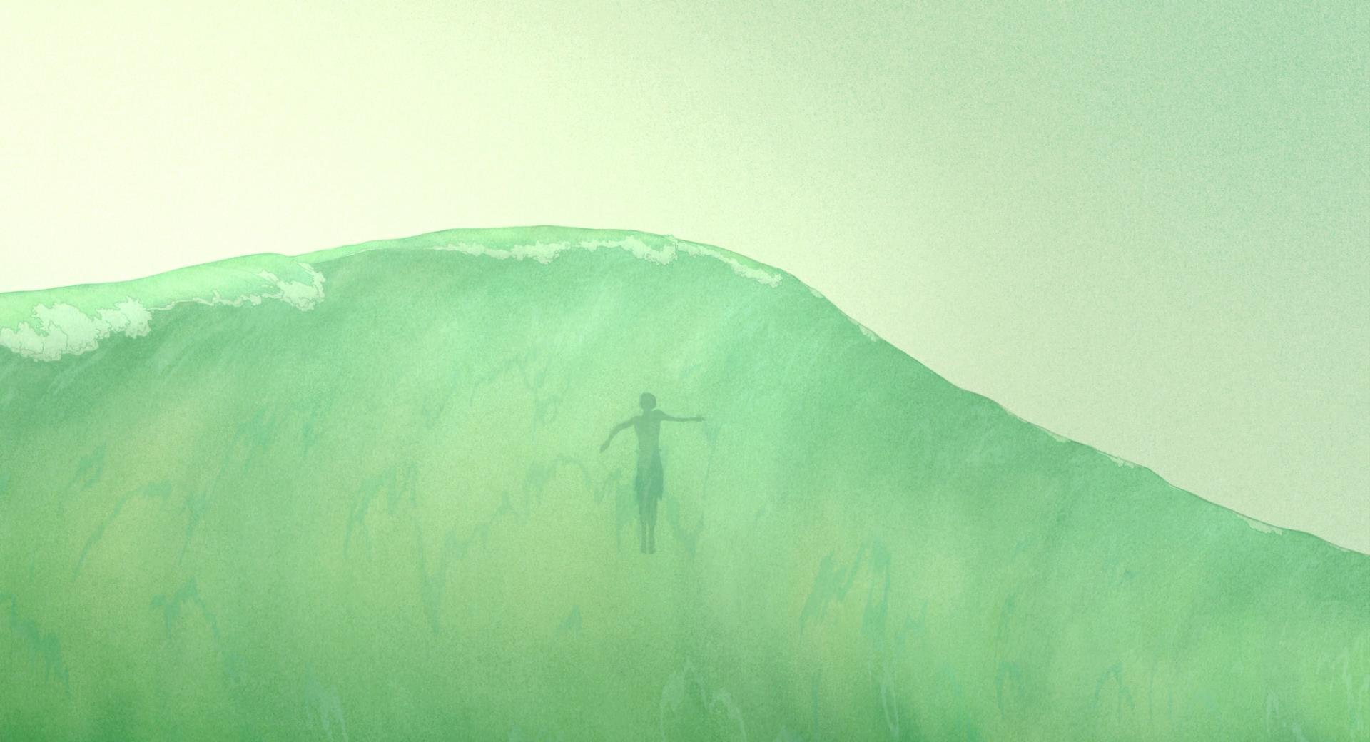
The Red Turtle is a visually gorgeous film which looks as beautiful in motion as it does in stills with the fantastic uses of colors conjuring up dreamlike images.
The Red Turtle is
de Wit’s minimalism refined to a point that is almost devoid of imperfections.
Although
The Red Turtle is removed of words, you still hear the characters breathe, grunt, gasp and exclaim and likewise the sounds of waves crashing against one another haunts the audience. The music is equally haunting in its beauty, adding an emotional depth to each scene whilst also providing a voice for the main character and his thoughts and feelings.
Even though
The Red Turtle is a film in which not much happens, I still felt constantly stimulated by both by the rich, sharp and detailed images and the ambiance that the sound provides. It’s a beautiful, well-crafted film that combines everything
de Wit has done up until this point refined to almost perfection, culminating into a tour de force that is a breath of fresh air. The Red Turtle is simply, beautiful.
9/10

