Defective or Disappointing UK Anime Discs

Are you sure? I literally cannot see any
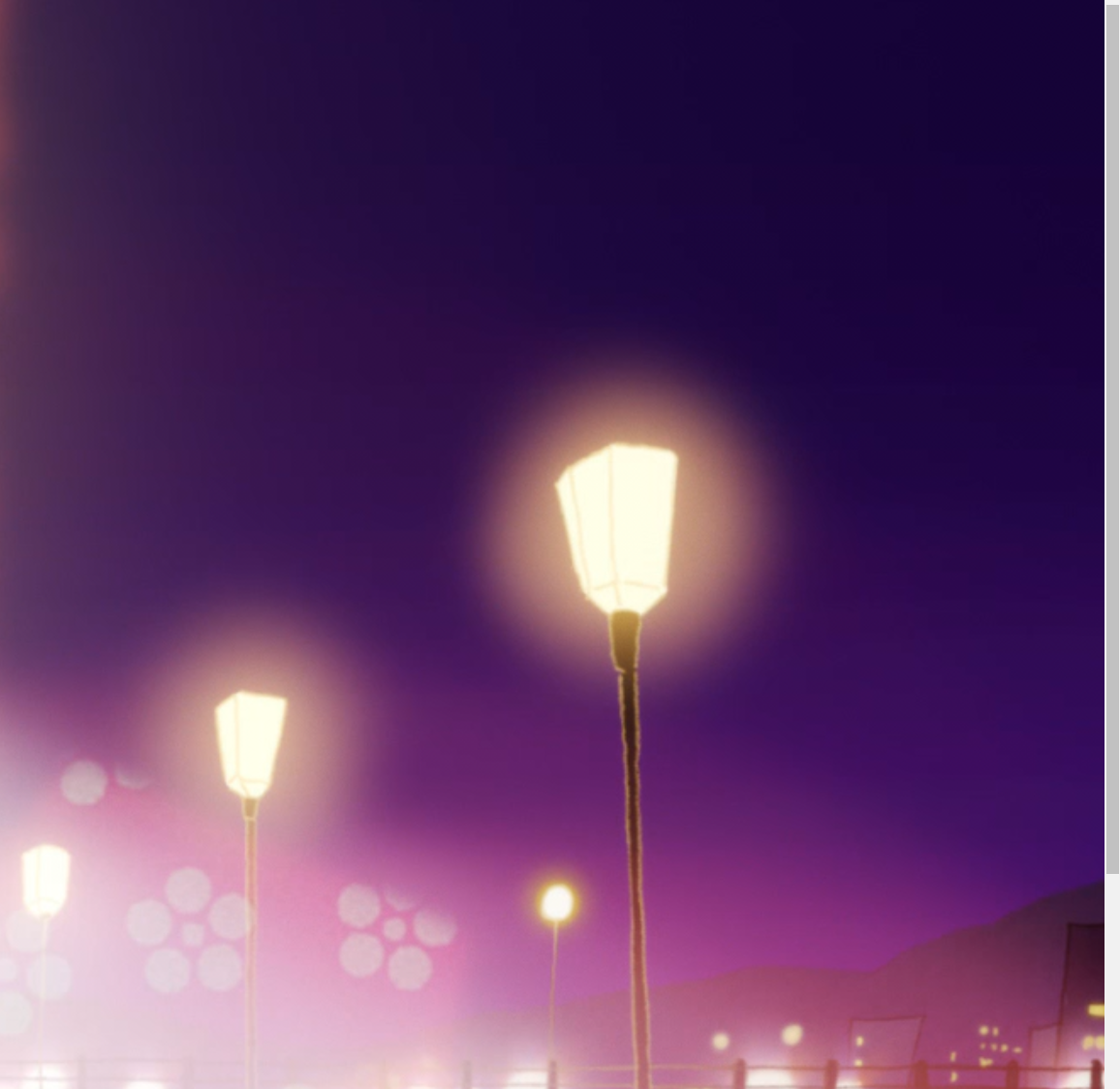
xrGj2Bm.png

b7TPy9x.png

uLJ0R7i.png

If you can't see it in these pictures you should consider getting a new display. I'm more than happy if you can prove me wrong since I also bought the AL release but haven't had time to watch it.
 
If you can't see it in these pictures. . .
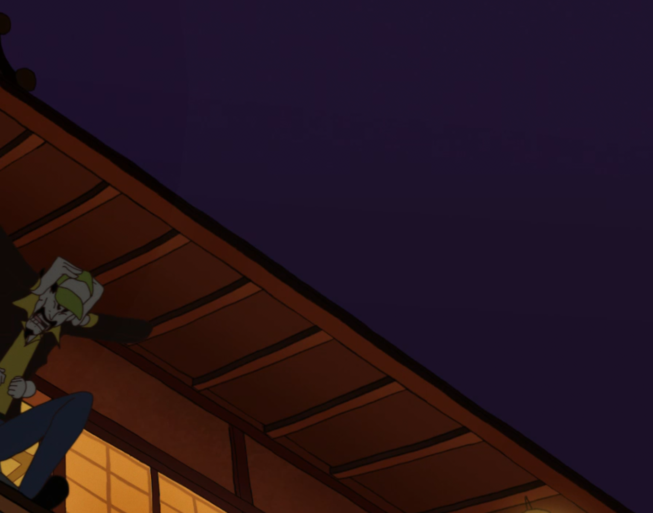
Wow. I'm looking at the above pics on my phone, and I zoomed them in all the way. I guess I can see what could be construed as banding around the lights in the top pic, and... is that supposed to be banding at the very top right of the bottom pic? (Not that I'd even be looking there while watching the film.)

I cannot see anything resembling colour banding in that middle pic at all.

This whole colour-banding debate seems to have become pretty extreme of late, in my own view, in terms of standards. 😕
I wouldn't be happy for this release to get added to the list for that, personally speaking.
 
I mean 4 or 5 other people have complained about it and I can read AoAs, FUNIs (Post 2011 one), Sentais, Amazons, CRs all fine only AL FRs clash because no border means it clashes with backgrounds
 
What fun logic. "If you can't see the banding, you need a new display that will make the images look worse".
To be fair, the logic is more along the lines of "if you can't see the banding on your display, which other "details" aren't visible". So a new/other display could bring out more details, inadvertently also highlighting problems present in the source. It's the same reason that analog TV looked worse on HD TVs back in the day.

To me the banding is quite visible in those screenshots, which is a pity. Though, personally I'd have to see it in motion to determine how bad/detracting from the viewing experience it actually is, but it doesn't bode well. So for me it would likely be a (slightly) disappointing release.

Also, you can actually get better at spotting banding, which I strongly not recommend for anyone not noticing it (as much/often) currently. :)
 
It's certainly not what I'd consider "fine", in fact it's so annoying for me that I will now reconsider buying anything done by the French side (although it has been said that it's gotten enough complaints that it'll be brought up in future). Like sure sitting a couple of feet away it's okay, but from across the room I find them harder to read than they need to be.

And my prescription is fine.
 
Are you sure? I literally cannot see any in that set of jpgs. Nor did I notice any when I watched the disc recently.
You're the guy who thought Re:Zero was acceptable...

Anyways, yeah- the banding is pretty bad. If you can't see it, fine- but it's there.

AL, please never use French authors unless you have to... they pretty much always end up looking bad with a few exceptions.
 
Honestly banding is one of those things where you don't actually notice it at first. To me it took years to finally understand what it meant, and Crunchyroll helped explain what it is fully thanks to their poorly encoded streams like Steins;Gate which literally shoves the banding in your face.

The point is, not everyone will notice it so it may not be of concern to them, but once you do notice it then you'll likely spot it with other titles and at times it can be pretty tedious. There are some shows that had banding in the first place I believe so it does depend on whether or not it was from the original source or the author of the localised Blu-ray discs.
 
Yeah, both series of Steins;Gate (Blu-ray) and 0 (Crunchyroll) have very noticeable banding and are by far the worst I've seen. But it still didn't put me off the story or liking the characters!
The screens above are all very minor, I had to zoom in quite a bit on my phone to notice. I haven't seen the film in action though to judge for myself, although if it's anything like the first episode of Tatami Galaxy, I'll be too busy reading the subs to notice!
 
Won't lie, it is so slight I have to get close enough for my nose to touch my monitor to even notice it. Certainly not worth making any fuss over.
I agree that shot alone isn't worth fussing about, but the other ones are worse.

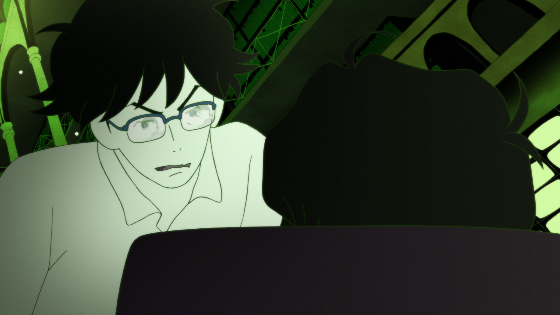
This one:
GAgcQhC.png

is pretty noticeable. Look at the chair on the right. See how the colour shifts? That's what I'm seeing in all of those screencaps to varying degrees.
 
I agree that shot alone isn't worth fussing about, but the other ones are worse.

This one:
GAgcQhC.png

is pretty noticeable. Look at the chair on the right. See how the colour shifts? That's what I'm seeing in all of those screencaps to varying degrees.

I can see it sitting a few inches away from my monitor, but on my TV from a few feet back? Unlikely. Making a stink over the likes of Re:Zero or Steins;Gate's authoring I can get behind, because you don't have to strain yourself to see the flaws, but I feel like giving distributors crap for authors like this when they're perfectly fine and barely noticeable to 90% of the viewing audience is a bit much.
 
Nice try, but a little wide of the mark. ;)

I guess my phone just doesn't have the colour palette to allow the banding to show up. I'll take a look at your zoomed-in shot on a monitor at some point.
I forgot exactly what you said, so I take that back. Sorry man.

No problem- if your phone has a good display (latest iPhones and Samsung Notes, and/or anything OLED) then it should appear fine.
 
but I feel like giving distributors crap for authors like this when they're perfectly fine and barely noticeable to 90% of the viewing audience is a bit much.
I get it, but isn't the point of a Blu-ray release to make the best possible looking version? If it's from the source- then that's fine- but the film is a 100% digital production, which lowers the chance of it being a source issue- I'd assume it's the compressionist's fault- but unless I saw the source files, I can't say for sure.
 
Back
Top