UK Anime Distributor Anime Limited Discussion Thread

We're actually using a different authoring house entirely for Amanchu - we've put a lot of work into QC on this one and personally I'm very happy with it!
Amanchu_-_Happy_Pikari_sped_up.gif
 
Here's an example, which tbh doesn't look nearly as bad to me at my PC than it did on my TV from across the room...
00000.mpls_snapshot_00.00.27_2018.09.20_23.11.04.png
Looks exactly like the type Netflix uses.
Wait till you’re trying to read those subs against the white of school uniforms.
Exactly. I was watching Kill La Kill on Netflix the other week and it was near impossible at some points especially as it moves at 100mph most of the time! Sound is obviously much slower so might not hurt as much.

And here's an example of what I consider vastly superior...
L180bL9.png
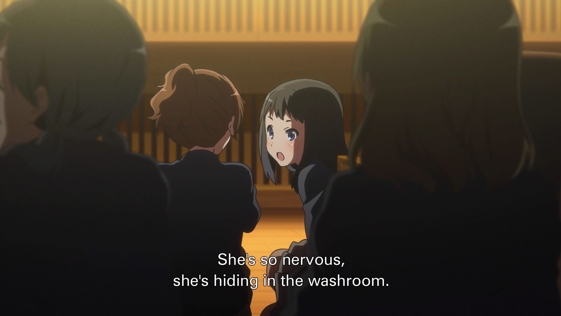
EDIT. Is that second example something you mocked up, or from the PonyCanyon release?
said he didn't have the PonyCanyon release to compare so he or someone else must have mocked it up.
Here's the Crunchyroll version, very similar apart from the layout and much better than the first pic:
Screenshot_20180921-223622.png
 
Sincerely it would be really good if the subtitles are a bigger one with a more pronounced black outline :-/
According to the screens posted, there is color banding on Sound Euphonium?
I would like to know a little more about the picture quality for Sound Euphonium!


Indeed, and unfortunately no Amanchu announced for the branch FR of All The Anime ;-(((

I would have liked to see March comes in like a lion in France, but hey the market is special ;-(((((

thank you in advance ^^


https://forums.animeuknews.net/javascript:void(0);
 
I definitely prefer the thin font over a fat font, it's easier for me to read fast... But I do like the Crunchyroll sub style the best out of the three. I also like my font to be a smaller size than what most people would prefer, so they don't hide so much of the image behind them. .
 
I wouldn't say they're too small to read no, like I can only speak for myself and for me personally the font is too thin and doesn't have enough of a black border around it.

Here's an example, which tbh doesn't look nearly as bad to me at my PC than it did on my TV from across the room...
00000.mpls_snapshot_00.00.27_2018.09.20_23.11.04.png

And here's an example of what I consider vastly superior...
L180bL9.png
I sure hope that first screenshot is from badly configured VLC again. The colors seem off and a lot of banding.
Diff.pics - Untitled
 
I sure hope that first screenshot is from badly configured VLC again. The colors seem off and a lot of banding.
Diff.pics - Untitled
It's not captured from a badly configured player. The colours are slightly off, assumedly due to the banding.

I've only had a very quick look at the disc, but as for the video - there is quite a bit of banding and noise inherent to Kyoani sources in general, but I think it's fair to say that the Japanese and US releases have done a better job at compressing it down than the author for this disc. There's more banding (and noise) than both of those - in one instance the CR stream had less banding. There's a lot of free space on both of the discs here, as there was with Kiznaiver (around 12-13gb). I wonder if utilization of that space would have helped things for Euph especially, considering the problems already inherent in the source.

All said I'll emphasize that I'm not saying this release is bad. None of the releases for Euph are perfect by any means, but I feel it could have been more in line with those.
Shame, I'll be skipping this then :(
 
Back
Top