mrclt1994
Hunter
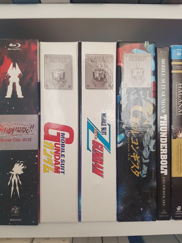
Received Zeta today and I can't say I'm too impressed with the art box.
1. The art from the front cover goes over onto the spine :/. That's the most noticeable but even the top spine has some overlap onto the back cover. Clearly, whoever constructed this did not line things up properly and the result is it looking rather cheap with not much attention paid to it.
2. The crappy looking grey dots which featured all over the MSG 0079 art box are present on there also, even though I understood that they wouldn't be. Seriously, who thought they were a good idea? They look like stains. Not impressed.
3. Stacked disc tray is not really a nice thing to see.
I must say after waiting so long for this, it is kind of disappointing that the art box wasn't handled better.
Last edited:

