You are using an out of date browser. It may not display this or other websites correctly.
You should upgrade or use an alternative browser.
You should upgrade or use an alternative browser.
What did you RECEIVE today? PHOTOS EDITION!
- Thread starter bakum4tsu
- Start date
Luna
Death Scythe

Continuation of my post in UK Anime Distributor - Anime Limited Discussion Thread and basically half a rant post, I suppose.
- What in the world is the point of a slipcover over digipack/normal case if not both sides of the spine have the title on it?
- Could they just stop putting these stupid convention advertisment printed on the cover? It's not like as if these wreaths are price wins/nominations, it's just damn saying "Hey look, we have screened that at the convention we host outself". Whoever cares about that, when the screening is over already anyway?
- Could they stop advertising that furthermore on the backcover? Since when are back texts an outlet for copy-pasting advertising press releases? Like it's having as many lines as the content description? (Free movie)
- Thank goodness the rating logos went off without damage. I got the suggestion from a aqcuaintance that the rating logos are better to remove if you run a hair dryer over it. I opted out on holding the stuff under the blazing sun a couple of minutes.
- What design genius puts a booklet in a three-face digipack release that has no slipcover to wrap around it? First thing that happened was of course that it flopped out crashing on the table! (Fate Grand Order)
- What design genius makes the slip so tight that even shaking badly won't make the inner digipack come out. (The Free movie,) You have to put in two fingers between slip and digipack, which totally leaves marks on it, because you can't avoid scratching it with your fingernails. They have always a bit in the tigher side (and totally prone to deformation which made it exponentially worse, if you only make a mistake once to not store it vertically in a shelf, but horizontally in a pile below some other little things), but this one really is the worst of them all..
- I will probably never understand the point of a digipack when it's mostly empty faces anyway. It's not like their normal amaray case releases have much cheaper SRP anyway.
- There I thought wow, Free and Fate don't have much of a publisher/format symbol on the cover anymore, but there goes Kizumono (the latest release of these) to have that totally weirdly placed P on the upper left corner. At least it's not their ugly green P anymore.
- At least they aren't have these unseemingly "High Definition bluray lines" on the upper edge anymore
- Good glorious, they stopped printing the rating logo onto the inner digipack destroying all the artwork! But doesn't seem to expand to normal case releases even when they have a slip with rating logo sticker. Kizumono just suffers the same fate as Anthem as per normal packaging practice here.
Geez, and there I thought my Anthem of the Heart mess wasn't already bad enough, but now I think I've learned my lesson with this publisher. Hopefully never again. Only got these because there wasn't much of an alternative out there yet, but at least for Kizumono I really probably should have just gone for the AoA one or straight the Japanese one or wait whenever it comes to the UK.
@Luna - With festival laurels, the idea of including them on a cover, despite not being a win, is to show that the film is supposedly high enough quality to be included in said festival's "Official Selection". So it's less an advertisement but more a "This is good - look, a festival shown it!". I do agree it defeats the point when the distributor has organised said festival, however (like how Anime Limited's Miss Hokusai sneaks the Scotland Loves Anime Jury Award amongst Annecy, Fantasia etc).
Luna
Death Scythe
@Joshawott
I know, and I mean I don't mind them on movies like your name, the girl who leapt through time etc. Scotland loves anime probably also was a bad reference example. This advertised "festival" actually isn't one at all. The are just renting one movie place in some towns each for a weekend day to screen some movies on the same day in bulk. (Which appear to be simply all they can get their hands on.) Sometimes they invite some Japanese staff to it, but that appears to be all there is about it.
It's more like, AL did their screenings of A Silent Voice in selected Cinemas, too right? As did Funi with Attack on Titan or Sentai with No Game no Life Zero. Only they don't go call their a list of cinema places and dates a "festival". Not even the other German publisher do. These laurels they put on then border to scam imo. This isn't about quality whatsoever. They just want to advertise their screenings disguised as a honor badge. And it just totally destroys the artwork because they are always right in the middle of the cover.
Last edited:
thedoctor2016
Mushi-shi
I have the DE High speed and my digipack flies out when I just shake it and it is still in perfect condition when I opened it at least 10 times since Dec
Luna
Death Scythe
@thedoctor2016 Sounds like you got really lucky. oo I did check unboxing videos of it and they all seemed to have it be tucked in very firm.
Winkuru
Adventurer
I kinda went crazy with movies purchases during the past two weeks. I thought about waiting until i got everything but getting the rest could take a while so here's what i got so far (most of what i ordered)

Can't really see it from the photo but a decent chunk of corner of Donnie darko was chipped off. I couldn't find the piece inside the package which makes me think that zavvi send me a faulty product which is ******** (if they did) Luckily the inlay was only slightly damaged or otherwise i would have been furious but it's still annoying to have thing like this happen. I did get 25% of the price back but that was only 2.5 euros (i gues i can use that to get new case from somewhere)
Can't really see it from the photo but a decent chunk of corner of Donnie darko was chipped off. I couldn't find the piece inside the package which makes me think that zavvi send me a faulty product which is ******** (if they did) Luckily the inlay was only slightly damaged or otherwise i would have been furious but it's still annoying to have thing like this happen. I did get 25% of the price back but that was only 2.5 euros (i gues i can use that to get new case from somewhere)
IncendiaryLemon
Captain Karen

My Madoka vinyl arrived today. I have nothing to play it on, but hey, the art looks nice. I'd like to display it, so I'm on the lookout for vinyl frames that can hold a double album. Any suggestions would be much appreciated!
Lambadelta
Mad Scientist
Oh you actually went and bought it? I remember when you first expressed interest at its press release.
I know we have someone on the forum who has a hobby of framing Laserdiscs, which are the same size if I remember. Try, and find them for some good suggestions.
I know we have someone on the forum who has a hobby of framing Laserdiscs, which are the same size if I remember. Try, and find them for some good suggestions.
NoSurprises
Hunter
I use some 'Flip Frames' from Amazon, since they hold a double album and I can change them out easily, being the indecisive so and so I am. They're a little pricey for what they are though.
Also the option of any bog standard vinyl frame on Amazon, but if they're anything like the Ikea gladsax that got discontinued, you may have to store one of the discs elsewhere to get the cover to fit in the frame with the back secured.
Also the option of any bog standard vinyl frame on Amazon, but if they're anything like the Ikea gladsax that got discontinued, you may have to store one of the discs elsewhere to get the cover to fit in the frame with the back secured.
crashmatt
Death Scythe
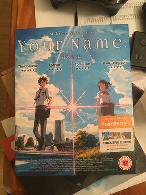
View attachment 1693 I picked up the Sainsbury's exclusive version of Your Name on DVD on the way home.
View attachment 1694
I picked up the Sainsbury's Exclusive version of Your Name on BD on the way home.
View attachment 1695
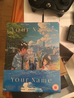
My second steelbook copy of Your Name on BD arrived today.
Seriously how many copies of the same film do you need? I get that you love it I just don't know why you need multiple copies of it.
Seriously how many copies of the same film do you need? I get that you love it I just don't know why you need multiple copies of it.
Well there's one for him, one for his New Game! waifu, and another for the both of them.
IncendiaryLemon
Captain Karen
I should probably watch my JP copy at some point.
I pre-ordered it ages ago, totally forgot about it, then realised when I had a mystery Amazon JP transaction in my banking app.
Oh you actually went and bought it? I remember when you first expressed interest at its press release.
I pre-ordered it ages ago, totally forgot about it, then realised when I had a mystery Amazon JP transaction in my banking app.
Dave1988
Death Scythe
Wow that looks nice. Lovely artwork
My Madoka vinyl arrived today. I have nothing to play it on, but hey, the art looks nice. I'd like to display it, so I'm on the lookout for vinyl frames that can hold a double album. Any suggestions would be much appreciated!
Luna
Death Scythe
Seriously how many copies of the same film do you need? I get that you love it I just don't know why you need multiple copies of it.
How high is that count already actually?Seriously how many copies of the same film do you need? I get that you love it I just don't know why you need multiple copies of it.
Lambadelta
Mad Scientist
How high is that count already actually?
Well he has JP copy, 2 Steelbooks, 1 Standard BD, 1 Standard DVD and has the Deluxe on order so that would 6 copies of the same film?


