Upcoming UK Anime DVD Artwork!

Status
Not open for further replies.
Joshawott said:
Heck, if you take that and replace the "Buy it! Buy It!" with something like "Directed by Cowboy Bebop's Shinichirō Watanabe", then it would actually be pretty good../quote]

And that's the kind of useful thing that could justify actually being somewhere on a cover, particularly as that cover is essentially a series of images rather than one single piece of art
 
Mangaranga said:
screenshot20130320at175.png

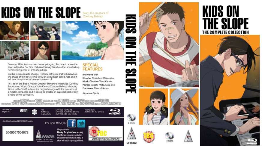
I actually hate this design, especially the spine. It's like MVM don't have enough money in their budget for Colour ink.
I think they're trying to evoke a classic Jazz vinyl sleeve - at least on the front panel, and I applaud the attempt. The US cover is a nice image from a nice anime, but downgrades the importance of the jazz. The Aus/UK cover echoes some of the classic graphic design of jazz 33's. But you're right - not sure what they're doing with the rest.

But I'd hate to have the generic image of the US release - it's all about the jazz! Weren't the original R1 Cowboy Bebop covers similarly jazz-stylish?
 
burtkenobi said:
Mangaranga said:
I actually hate this design, especially the spine. It's like MVM don't have enough money in their budget for Colour ink.
I think they're trying to evoke a classic Jazz vinyl sleeve - at least on the front panel, and I applaud the attempt. The US cover is a nice image from a nice anime, but downgrades the importance of the jazz. The Aus/UK cover echoes some of the classic graphic design of jazz 33's. But you're right - not sure what they're doing with the rest.

But I'd hate to have the generic image of the US release - it's all about the jazz! Weren't the original R1 Cowboy Bebop covers similarly jazz-stylish?

Hmm, fair point. Though now i'm wondering if it was intentional or coincidence, they generally don't show that much insight/flair with other covers.
 
This is the French Kazé artwork, but as the UK release artwork has been the same for volumes 1 and 2, can't hurt to share them here:

51UF1L9KbJL._SL500_.jpg

81hgGj0HorL._AA1500_.jpg
 
Dannielle said:

Hmm, not bad, i'm not a fan of directed by, animation by but at least they took a mirrored approach to the displaying them, Kinda odd seeing the cover in colour opposed to the black and white release a while back
 
No unnecessary clutter? (BBFC logo, other massive logos) check.
No Manga triangles or bubbles? check.
No intrusive Manga type text? Check

Don't get me wrong I love, love, love this cover it's just... maybe the blue?
Something about it on the banner and/or spine doesn't seem right.
Other than that, it's pretty much perfect.

Also I do have to ask why the UK distributors like to have really big logos.
 
Hmm, I dunno. The basic four-character design is great but I don't understand the purpose of the directed by/animated by strips. Who knows Shinichiro Watanabe by name but not Cowboy Bebop? Are there really many casual fans who'll browse the anime section of HMV (assuming it still has an anime section, idk) and go, "Crivens, animated by Sunrise! I must purchase a copy of this forthwith". Also, the Anime Limited logo is too big and obtrusive, and of course the dreaded BBFC logo will have to go on the front at some point.

But I'm sure it's not the final cover so Andrew can fix all that... right? ^_^
 
My only suggested changes would be removing the Anime Limited logo that's above Jet's head and make the one on the spine actually small enough to fit on the spine. Maybe make it the same size as the BBFC logo - including the white circle around it? (and make that fit too? xD). Also, I am slightly bugged about the orientation of the four images on the cover. I personally would have all four images the same size and with the same sized spaces between them. As it is, Spike and Faye's images are larger than Jet and Ed's, which means that while they stretch to the tops of the cover, Jet and Ed's have a black border above and to the right of them, whereas Spike and Faye have one below.

It's also a personal bug of mine that earlier titles are advertised as being by the director/etc of later titles (*glares at Studio Ghibli's UK releases*). Personally, I would have went with something like "The cult debut of director Shinichiro Watanabe" (it was his debut as a lone director iirc).

Overall though, the cover is a lot better than those that other companies are putting out. I feel that the few criticisms I have are actually little nitpicks - so Andrew, if it feels like I'm nitpicking it, I apologise! It's actually a really great cover - probably the best Cowboy Bebop has ever had in the UK.

Going to put in my pre-order soon.
 
Status
Not open for further replies.
Back
Top