Upcoming UK Anime DVD Artwork!

Status
Not open for further replies.
Rosencrantz said:
Dannielle said:
[Mayo Chiki Cover]
Wow that's nice, very nice. Why on earth didn't Sentai use that if it was available?
It gets all the main characters on the cover, but seems rather busy. Sentai for whatever reason went with art by the original illustrator rather than the anime designs.
 
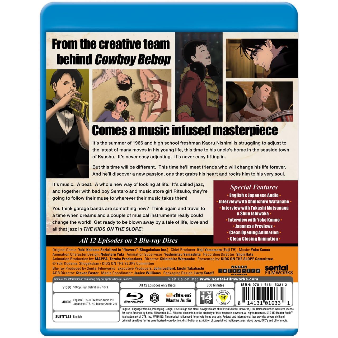
Not exactly a UK release but...

81SbBjoVOKL._AA1500_.jpg

81t1HfGsRVL._AA1280_.jpg


Hanabee and MVM's release has to look as good as this and have the same features. I won't forgive them if it does not.
Nice to finally know however that it is 1080p and not 1080i, and there also seems to be some nice extras too.
 
Shiroi Hane said:
Rosencrantz said:
Dannielle said:
[Mayo Chiki Cover]
Wow that's nice, very nice. Why on earth didn't Sentai use that if it was available?
It gets all the main characters on the cover, but seems rather busy. Sentai for whatever reason went with art by the original illustrator rather than the anime designs.

Ye the sentai cover's not bad, Just I think the MvM one's a better fit. though I just noticed it's 2 discs, while sentai did 3. On the basis noone wants to spend more money than they need to that would suggest Sentai went for 3 discs becuase the files were bigger and they needed 3? which would kinda imply the UK release on 2 DvD's might not be as good, though 6 per disc is the usual so I dunno?
 
Oh MVM.

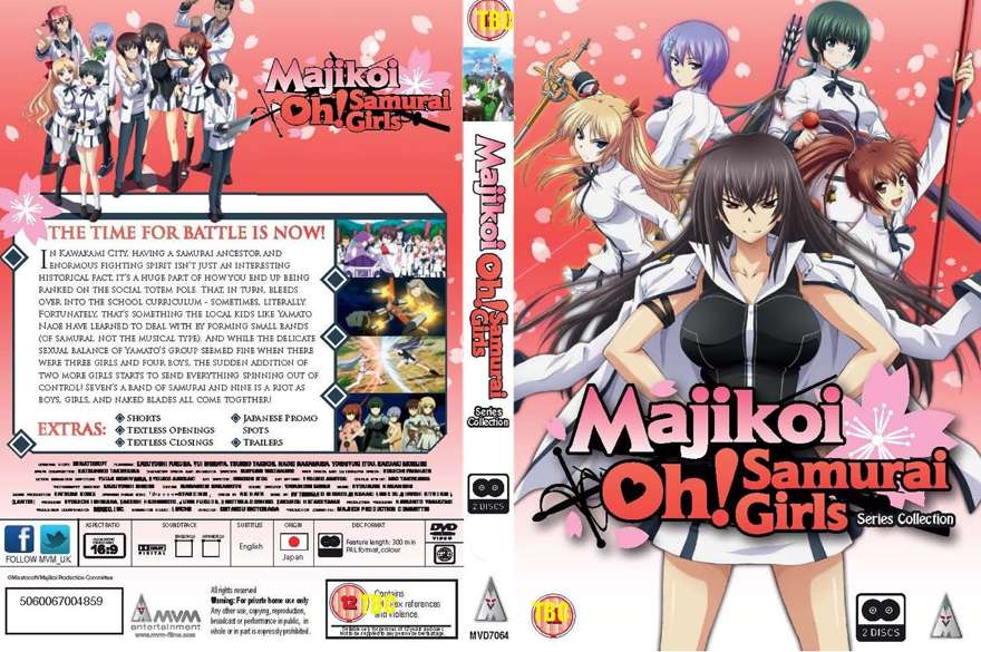
Cover created by someone with an understanding of aesthetics:
Mangaranga said:

Cover created by someone... else:
Dannielle said:

That brick wall like collage of pictures. That procession of logos marching across an otherwise blank area. That left aligned title in a rectangular space with different margins to every side. That uninspiring monotone spine. That sodding disc pictogram.
 
Although they're essentially using the same artwork as Sentai, the awful formatting of MVM's makes me vastly prefer Sentai's cover artwork.
 
Why do they have to put always XX disc set??? Why dont they stick that to the spine/back?? Nah lets put on the front!!!
 
MVM's Disk count = Manga's triangle of doom.

So it seems they've gone for the first art cover which Sentai had up. Though I would prefer the cover that Sentai now use.

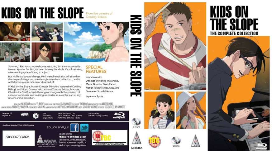
As for Kids on the Slope, MVM's cover must be that bad for it to refuse to load.
 
ilmaestro said:
I think they just enjoy reading ayase's posts in this thread, and don't want to stop giving him reasons to do so.
Indeed. This made me chuckle:
That procession of logos marching across an otherwise blank area.
It brings forth an amusing mental image of the logos being called into action and sent onto the battlefield to do their duty.

My only problem with the Ano Natsu cover, disc count pointlessness aside, is that they've put an image of the male lead on the spine. Someone needs to tell MVM that he's not the reason people watch that show.
 
reborn said:
MVM's Disk count = Manga's triangle of doom.

So it seems they've gone for the first art cover which Sentai had up. Though I would prefer the cover that Sentai now use.

As for Kids on the Slope, MVM's cover must be that bad for it to refuse to load.

It'd be nice if they could swing by this thread like Manga did and consider revising the practice.

I feel like they are forgetting the basic idea which is

Make the customer pick the item up

Giving all the info on the front is detrimental, what you really want to do is have someone see something that looks good, pick said item up and look at the back. The blurb and pictures used for the back need to seal the deal on the sale. There's plenty of room on the techincal specs section to have a little disc logo, it doesn't need to be on the front or even really on the spine.
 
Heck, if you take that and replace the "Buy it! Buy It!" with something like "Directed by Cowboy Bebop's Shinichirō Watanabe", then it would actually be pretty good.
 
screenshot20130320at175.png

I actually hate this design, especially the spine. It's like MVM don't have enough money in their budget for Colour ink.
Sentai's cover easily looks the nicest, Hanabee at least has some colour on the spine and less white, then we have MVM's which looks like something you would print at home.
A massive disappointment seeing as a few of their latest covers have got a bit better.

I know I'm being incredibly petty here, but I may have to get Sentai's BD just for the nice cover/disc art. This really does look that bad.
If someone from MVM reads this, If you want me to buy Kids on the Slope from you please give it a good cover. Hell, just use Sentai's cover and slap on the mandatory clutter like the BBFC logo.
 
Status
Not open for further replies.
Back
Top