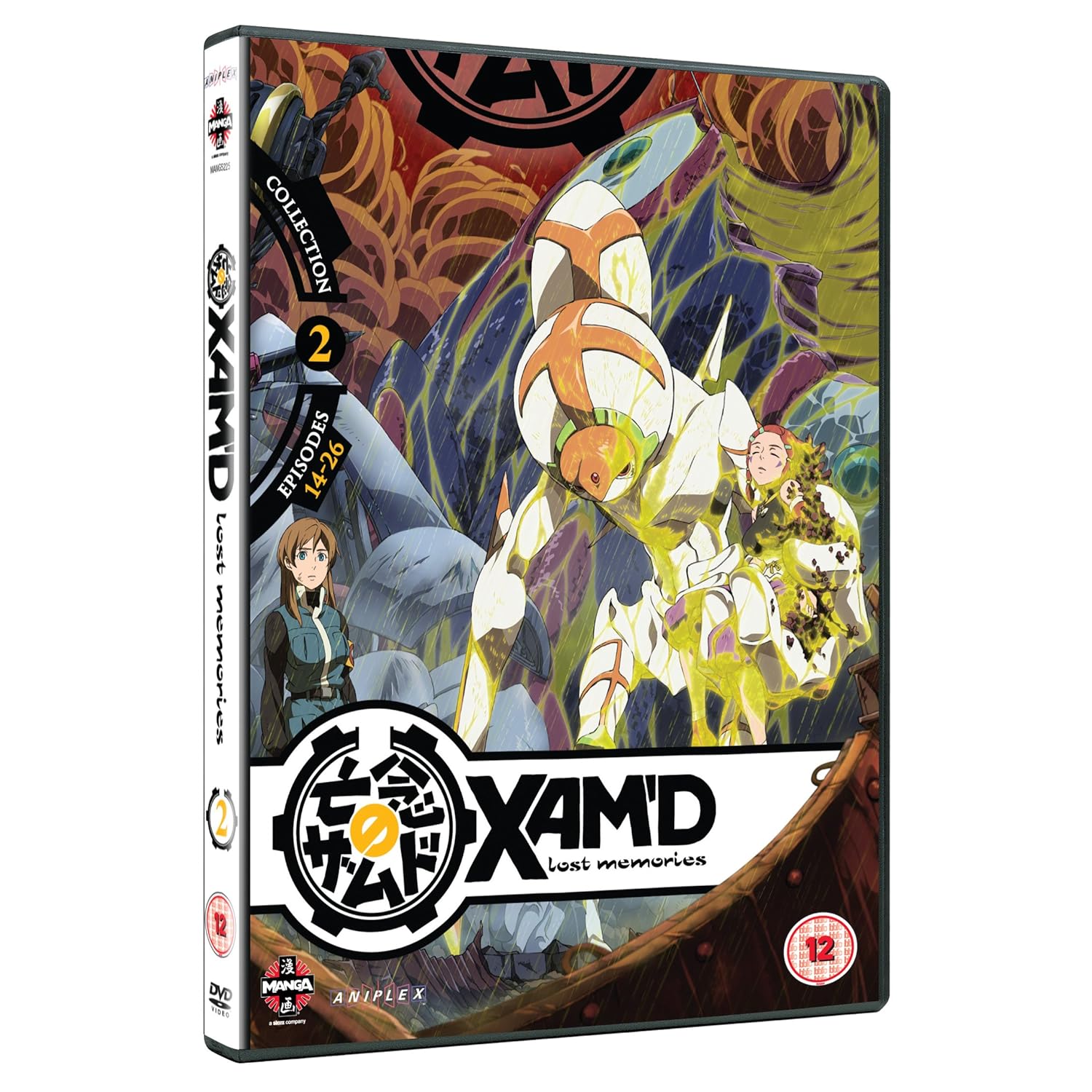
Upcoming UK Anime DVD Artwork!

Status
Not open for further replies.
Sparrowsabre7 said:
Also: anatomy fail. Look here her legs indicate her butt to be right? Compare with where her back curves in and where her clothes indicate her bellybutton to be. She has one massively weird torso...

And that's not even beginning to compare her upper arm length, perspective be damned, her left upper arm is WAY longer than her right. Seems like she was drawn by either Pat Lee or Rob Liefield... or maybe Pob Leefield.
Oh god those arms, yes.
Her hands are also the same size, as well as her right upper arm being shorter than the lower.
Does look like her bellybutton is above her very, very high skirt.

Mind the show is a troll, so it might be intentional.
 
Sparrowsabre7 said:
Also: anatomy fail. Look here her legs indicate her butt to be right? Compare with where her back curves in and where her clothes indicate her bellybutton to be. She has one massively weird torso...
Hah, I never noticed that until you mentioned it. Distended snake torso ahoy!

It's not THAT bad a cover though. No worse than that Sekirei monstrosity on the previous page.
 
fabricatedlunatic said:
Sparrowsabre7 said:
Also: anatomy fail. Look here her legs indicate her butt to be right? Compare with where her back curves in and where her clothes indicate her bellybutton to be. She has one massively weird torso...
Hah, I never noticed that until you mentioned it. Distended snake torso ahoy!

It's not THAT bad a cover though. No worse than that Sekirei monstrosity on the previous page.

I dunno, sekerei was at least clean and well-coloured, see my piss-glare comment again for TGWLTS :p I mean the glare alone is gratuitous, but to have it such a nasty shade of yellow is just Yeuchk!
 
81lbryneoklaa1500.jpg

91klgjznoelaa1500.jpg
 
Oh sweet lord...2001 nights looks like bad cgi =S From the makers of Appleseed!? That looks like School Computer quality cgi, surely they could make the cover look better than that?
 
Sparrowsabre7 said:
Oh sweet lord...2001 nights looks like bad cgi =S From the makers of Appleseed!? That looks like School Computer quality cgi, surely they could make the cover look better than that?
Same as FUNi's except the title.
FUNi's is down as
"TO (トゥー): Film Collection: Elliptical Orbit & Symbiotic Planet"
 
Damn, the Sekirei cover is pretty offensively bad, but that Sora Kake Girl one... maybe the covers contributed towards me not importing the show.
 
Beez show themselves to be masters of beautiful, understated packaging yet again.

Now if only I liked the character designs...
 
How could you not love those cute widdle cavity cheeks?

I don't like that cover much. Something about it seems... off. If Beez were going for understated they should have chosen the image Right Stuf used for the reverse of their box. I prefer both of these pieces of art to the Beez cover.
 
fabricatedlunatic said:
How could you not love those cute widdle cavity cheeks?

I don't like that cover much. Something about it seems... off. If Beez were going for understated they should have chosen the image Right Stuf used for the reverse of their box. I prefer both of these pieces of art to the Beez cover.

They definately do look a hella of a lot better. Still plan to buy the series as i found it interesting when it was airing
 
Considering the range of spectacular background art, bespoke character pieces, and intricate original designs available for the show, Beez have chosen a very plain shot with poor composition. Not bueno, as they say around the Med.
 
Sacred Blacksmith cover is the same as Funimation's. I was hoping Manga would use different art work as the guy in the background looks as though he's suspended in mid-air and it's a bit off-putting o_O
 
Status
Not open for further replies.
Back
Top