You are using an out of date browser. It may not display this or other websites correctly.
You should upgrade or use an alternative browser.
You should upgrade or use an alternative browser.
Upcoming UK Anime Blu-ray & DVD Artwork
- Thread starter NormanicGrav
- Start date
Terium
Brigade Leader
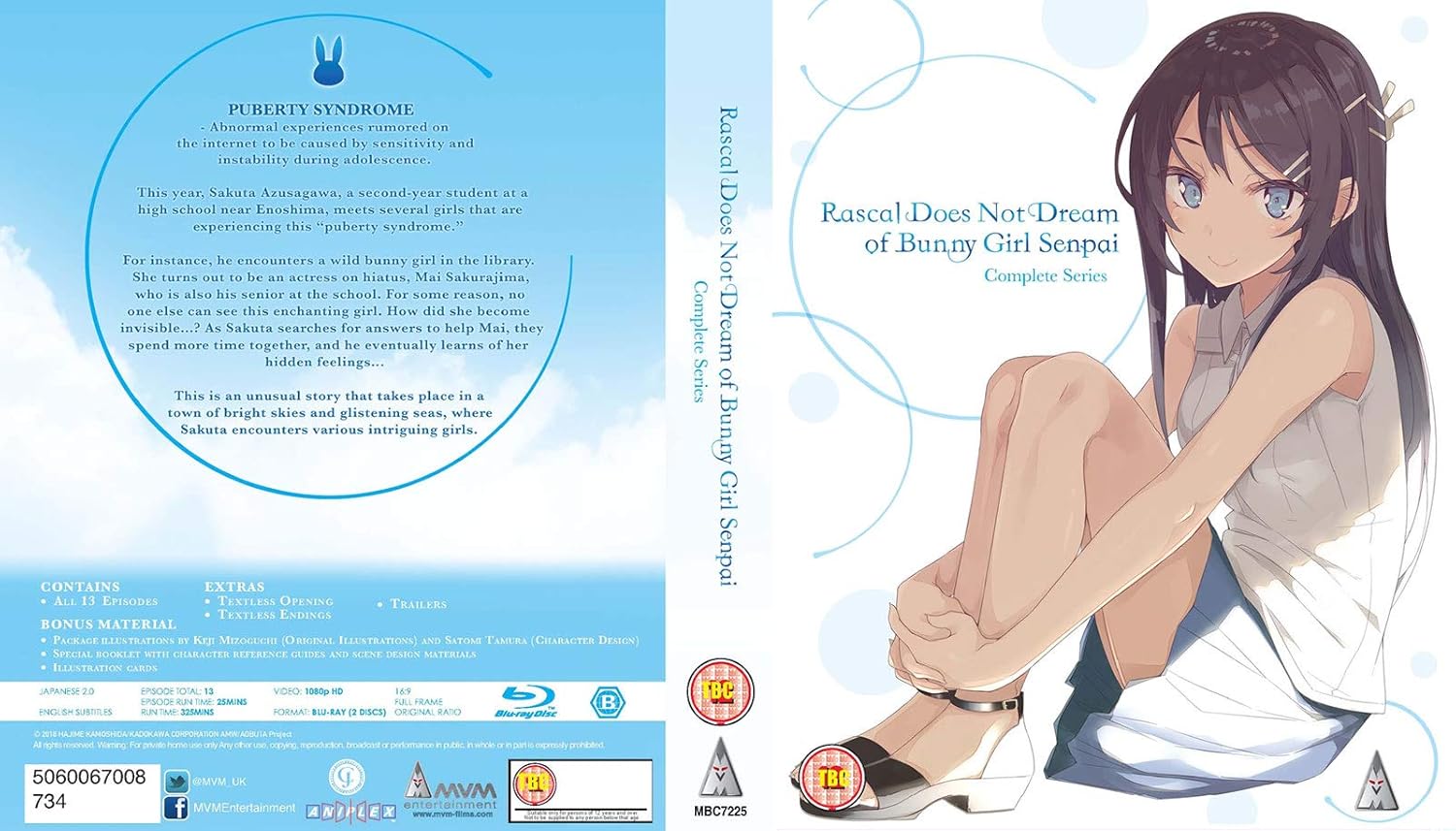
Splatter more age warnings all over the box MVM, why won't you... ughBunny Girl CE

Jon O Fun
Za Warudo
Never seen the series but heard really good things. This really doesn't sell it too me....Bunny Girl CE

thedoctor2016
Mushi-shi
It’s following the Monogatari BD art and highlighting each arcs girl. As there 5 arcs so 5 girls.
Jon O Fun
Za Warudo
Ahh I see what they were going for but the Monogatari releases at least have the girls in a location doing some kind of action. Shes quite literally just sitting in the cornerIt’s following the Monogatari BD art and highlighting each arcs girl. As there 5 arcs so 5 girls.
Magical Senshi
Vampire Ninja
The Garden of Sinners CE's initial artwork had BBFC logos, but the finalised artwork in the end has none (excluding the bottom of the box). Who knows, maybe the finalised artwork of Bunny Girl CE might only have the logo on the back (just like the Made in Abyss CE).Splatter more age warnings all over the box MVM, why won't you... ugh
But if it ends up like the initial artwork seen in the previous post, it could be worse. It could be Madman's upcoming CE with the huge ratings logos plastered on the box (their release of the Made in Abyss CE had them too).
TiagoCosta
Thousand Master
btw that's exactly the same over as AoA and Vol 1 of AoJ. I find it great.
TiagoCosta
Thousand Master
For me it reads the slipcase won't but the case will.
Terium
Brigade Leader
I don't understand the rating system at all but how come some releases just have the age restriction on the plastic when you buy the new product but most print the ugly thing on their art? I know there's like a law for having the logo but why not ALWAYS have it on the back with the text and info? I don't understand the need of plastering that ugly thing on the spines or front.
Depends on how the release is designed. It is required by UK law that the BBFC ratings have to be visible in some form when you look at a UK release. In the past it had to be on the front cover, back cover and spine, but now it's just front cover and back cover. For LEs and Steelbooks, it seems the BBFC is fine with stickers and slipcovers to cover that aspect of making the rating visible on the front and back.I don't understand the rating system at all but how come some releases just have the age restriction on the plastic when you buy the new product but most print the ugly thing on their art? I know there's like a law for having the logo but why not ALWAYS have it on the back with the text and info? I don't understand the need of plastering that ugly thing on the spines or front.
Oldmario
Thousand Master
this probably wouldn't be in a shop but it's more of an outdated law that requires it on the front because obviously on a shelf you'll have it displayed showing the front coverI don't understand the rating system at all but how come some releases just have the age restriction on the plastic when you buy the new product but most print the ugly thing on their art? I know there's like a law for having the logo but why not ALWAYS have it on the back with the text and info? I don't understand the need of plastering that ugly thing on the spines or front.
ayase
State Alchemist
Not enough people know that BBFC ratings logos aren’t mandated on the spines. ADV UK didn’t bother with spine logos and their releases looked all the better for it. All UK releases would look better if nobody bothered. It’s not like anybody buys a DVD/Blu-ray without looking at the covers.Depends on how the release is designed. It is required by UK law that the BBFC ratings have to be visible in some form when you look at a UK release. In the past it had to be on the front cover, back cover and spine, but now it's just front cover and back cover. For LEs and Steelbooks, it seems the BBFC is fine with stickers and slipcovers to cover that aspect of making the rating visible on the front and back.
As for using stickers instead, I imagine it’s just an unnecessary extra expense for most releases. Presumably the stickers aren’t free and it would have to go through an extra machine to apply them (or someone would have to sit there sticking them all on).
Last edited:
ayase
State Alchemist
Fair point. I mean I guess vs. single sided covers they’re still going to cost more, but there’s almost no reason not to have a reversible insert if you’re printing on both sides anyway. It’s not like anyone can enjoy the artwork on the interior side through the blue filter of a BD case.Reversible covers don't require extra machines.
cyborg 002
School Idol
The Viz BD of JoJo is encoded with the wrong colors. The Kazé release of Phantom Blood / Battle Tendency has the correct colors and the Manga/Madman releases probably too.
This is news to me.
I have googled this and nothing pops up on the subject.
How wrong is the colors on the Viz release?
Scavenger
Straw Hat Pirate
I actually received Stardust Crusaders today and it unfortunately has the same color issue as the Viz release. They probably used Viz' encodes. As for how wrong it is:This is news to me.
I have googled this and nothing pops up on the subject.
How wrong is the colors on the Viz release?
Left to right: Manga UK BD (wrong colors) / Crunchyroll (correct colors)


Last edited:

