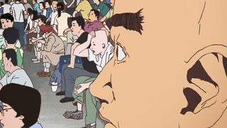
Back in the land of the living now, so hopefully I'll be able to catch up soon. I've watched a few episodes of Ping Pong before, but as its legitimate stream was on a site I had no intention of subscribing to and my conscience was getting the better of me, I always figured I'd wait until it was available as a home release before I finished it. Unfortunately, I can't remember how far along I got with it. Anyway, I rewatched the first two today.
Episodes 1-2
As I'm behind, I figured I'd just add some general thoughts on the visual style of the show, as it's probably what intrigues me most about Ping Pong, and I've been interested to read everyone else's comments on the art and animation.
I find it really tempting to describe the art as 'naive', but I don't think that's right. It's got a definite lo-fi thing going on, but at the same time, it's much more realistic looking than most other anime out there - it clearly took a lot of work to make the show look like this. It seems a strange choice at first, but I think it makes perfect sense the moment you see it in motion. This is very much a show about movement and every aspect of it reflects that; it's like the visuals have been pared down to make you focus on how they're moving instead of what they look like. Even when it's standing still, the shakey lines vibrate with the movement used to draw them.
The animation of the matches and the quirky visual flourishes like Smile's transforming arm are great and have already been mentioned, but the other thing that really drew my attention was the use of split screening - I'm a big fan of Osamu Dezaki's work from the '70s and 80s and that was one of his signature moves. It would be nice to think it's a nod to him, but I think it could also be going back a bit further, as John Frankenheimer's 1966 film Grand Prix famously made extensive use of split screening during the race scenes and set a trend for the technique in film and on tv going forward (or certainly helped to, I don't know if this was where it was actually coined). There's a handy montage of the split screen shots from the film here, if anyone's interested: Montage of split screen driving sequences from John Frankenheimer's Grand Prix
I also didn't know it was graphic design hero Saul Bass who did those scenes for the film. Today, I learned something.


