Custom Blu Ray Covers Guide and Discussion

As promised Konosuba Season 1 was finished in about a couple of months, with the long strech on time between covers I acquired Golden Kamuy Season 1-3 on blu ray and man did they mess up the spines on that, age rating logo isn't even lined up properly between the two season, just pure lazyness on Funis part. Also since Madman release season 3 and Funi/Crunchy UK didn't I got that and will be fixing that up to be consistant. Don't get me started on No Gun Life either. Good lord they really F'd that up, biggest joke of a slipcover I have ever seen.
 
Hey @N-11 Just a quick post to say I dig what you're doing with these. I've tried my hand at custom cover creation before but without a background in this kind of thing and not much time to learn It had....let's just say mixed results :)

I too get increasingly frustrated with some of the absolutely crap UK cover designs and the inconsistency of spines on some Blu ray releases wind me up no end. Like you, I understand some of these companies have deadlines and they need to get stuff out the door but some of them do look pretty bad for a retail release. Really hate MVM's in particular and AL's awful spines on standard releases too.

I realise it might be asking a lot but when you have the time do you have any interest in doing a BBFC logo free version of MVM's release of Serial Experiments Lain?
Thanks! I see we share similar opinions on the state of UK cover designs. I had a quick look at MVM's release of Serial Experiments Lain cover (I don't own it myself) and while I could give it a shot it might be harder to do due to them using an image for the background that doesn't have a constant solid cover. I could look for the image that they have used but more often than not it ends up being something only a licensor like MVM has access to. Nevertheless I will add it to the list and will give it my best shot.
 
Thanks man. I appreciate it. The back doesn't have to be the same, just do your own thing with the design. The main thing is that the BBFC logo is gone and the title is the right way around on the spine (Hate it when MVM flip the title so it's facing the other way around like a lot of EU releases do- makes it look like the odd one out in your collection).
This is something I'd like to get more into myself, made a bit of progress in learning last year but struggling to find the time lately. I have photoshop I just need to put more time into learning it.
I understand now, yeah thats fine I can whip one up for you one of these days. I also hate when they flip the title to be the other way around, it makes no sense and looks out of place because literally no one else does it. Kinda like MVM putting the BBFC logo at the top of the spine instead of the bottom like everyone else EVER or they will put it in the middle for some strange reason.

With life I often find it hard to make these quickly or in a good manner as I need to spend a good many hours making them so it can often become quite the time sink which is the reason why I only make one around every 2 months.
 
I totally understand regarding time pressure and very good of you to even contemplate doing it to be honest.

Speaking of the "flipping" issue I noticed the preview artwork images on sites like HMV and Amazon for the upcoming UK RB releases of Dragon Ball Super: Super Hero (steelbook and collector's edition) show the logo the opposite way around, really hope that's not how the final image looks otherwise its going to make the collection look terrible. Fingers crossed that's a placeholder. Yeah the BBFC thing really annoys me as well when they put it at the top, I'm sure I've never ever seen any other company do that EVER.

With MVM releases I've tried to stick to only picking up collector's boxes since they usually have the removable stickers for BBFC logos and often have more sensible designs in general. Annoyingly they didn't do a collectors release for Dororo which I'd really love to pick up but that ugly standard edition puts me off, might have to import a region A for that I think.
 
Its been awhile but I finally got the time to make the cover for season 2 of Konosuba so both seasons are done now. Just in time for the movie to come out, which I am going to have to do as well. No clean covers for Konosuba as I couldn't find any good images, if you know of any I could used let me know. I think I am going to work on Evangelion movies now since AL are coming out with the last one.
 
Last edited:
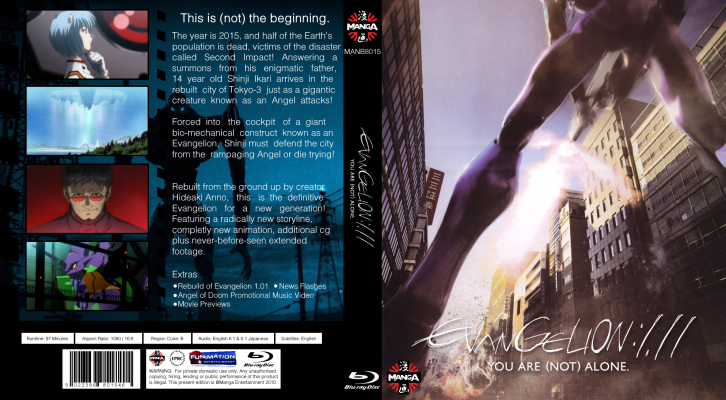
I have finished the covers for Evangelion 1.11 and will be doing the other 3 after. I am going to give Evangelion its own section due to the amount of different covers I have made and will make for each film. Man Manga UK really did a number on these, can't stand looking at them on my shelf. The last film I will do one for Manga UK and one for AL as I am sure AL will get the rights to the other 3 films I will do them in the AL style later so there is the choice between both.
 
Last edited:
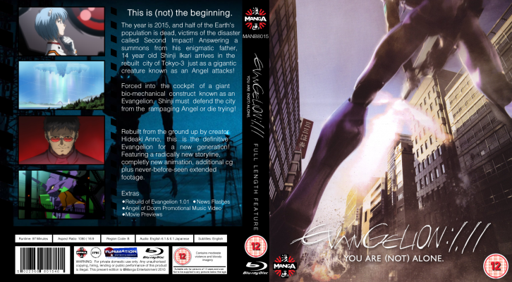
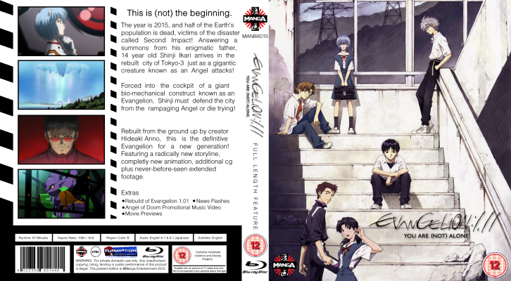
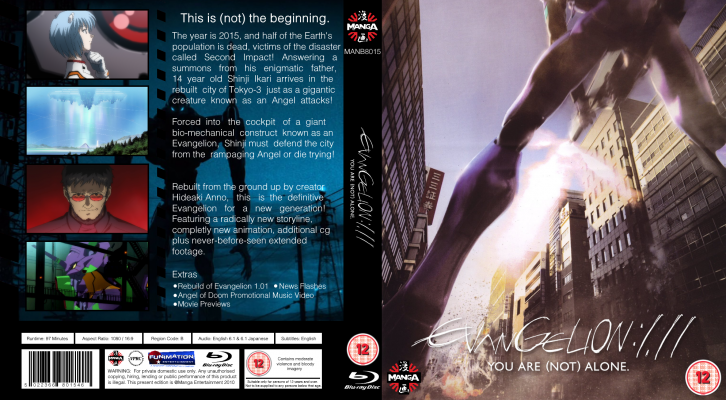
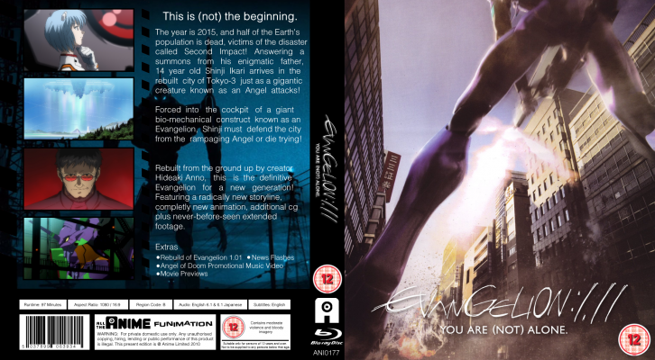
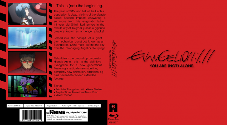
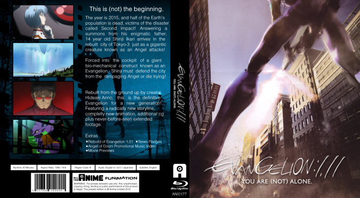
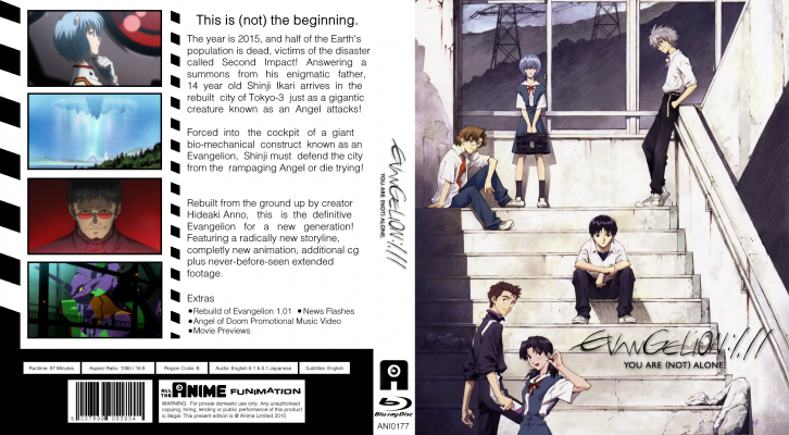
These cover are for the Evangelion 1.11. Manga UK versions


Standard Covers

Evangelion 1.11.png

Evangelion 1.11 Alt Cover V2.png

Evangelion 1.11 Alt Cover 2.png


No "Full Length Feature"

Evangelion 1.11 No Full Length Feature.png

Evangelion 1.11 No Full Length Feature Alt Cover.png

Evangelion 1.11 Alt Cover 2 No Full Length Feature v2.png


No Age Rating Logo

Evangelion 1.11 No Age Rating.png

Evangelion 1.11 No Full Rating Logo Alt Cover.png

Evangelion 1.11 Alt Cover 2 No Age Rating.png


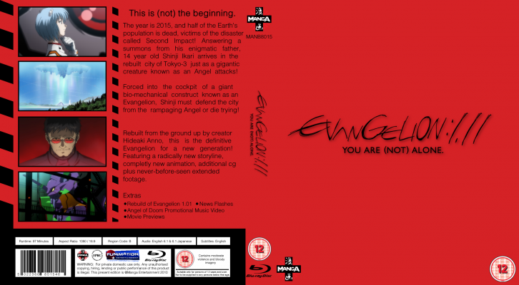
Clean Cover

Evangelion 1.11 Clean Cover.png
 
Last edited:
Shouldn’t there be an Anime Limited logo version of this one as well?
Don't worry I am going to work on a AL one as well, the Manga one was all I had time for. I will also be doing two different kinds of covers for each film. One with the basic colour art then one with an actual image artwork, like Mangas original ones.
 
Added some more covers, almost gave up on this idea because these images are not easy to find in high quality, Thanks Khara.
 
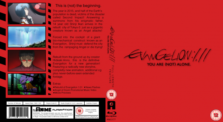
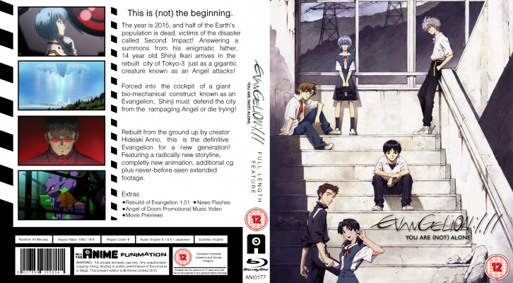
These cover are for Evangelion 1.11. Anime Limited versions


Standard Covers

Evangelion 1.11 AL.png

Evangelion 1.11 AL Alt Cover.png

Evangelion 1.11 AL Alt Cover 2.png


No "Full Length Feature"

Evangelion 1.11 No Full Length Feature AL.png

Evangelion 1.11 AL Alt Cover No Full Length Feature.png

Evangelion 1.11 AL Alt Cover 2 No Full Length Feature.png


No Age Rating Logo

Evangelion 1.11 No Age Rating Logo AL.png

Evangelion 1.11 AL Alt Cover No Age Rating Logo.png

Evangelion 1.11 AL Alt Cover 2 No Age Rating Logo.png


Clean cover is in the Manga UK section.​
 
Last edited:
Loving these, especially the alt cover 2s utilizing easily my favourite poster for that movie (I also dream of that poster extending to the left having a second half with the adult characters for a clean back cover!).

Of the four, I don't think they ever did a poster/cover featuring the characters only for the second movie did they?

Good luck finding good quality images for the others and hope you manage to complete the series!
Thanks! I am very happy with the way these turned out. Khara never made any more art in the same style, featuring the characters like the first two movie posters. If they did, they never used it or shared it to the public in any manner I can find. I am going to use Shinji and Kaworu poster for 3.33 alt cover 2 and then for 3.0+1.0 I am going to use the poster of all the character on the beach. It the best I can do to keep it a somewhat consistent theme.

Khara never did it for the CGI renders of the Evangelions that Funimation/Manga UK used for their covers of 1.11 and 2.22 either. I do have something planned for that. Khara are really inconsistent when it come to the art of the rebuilds.
 
I am going to use Shinji and Kaworu poster for 3.33 alt cover 2
Yeah whilst it is only these two on there, it is a great poster nonetheless. And with 3+5-4 they've struck gold in my opinion and unsurprisingly I'm very, very happy to have that beach poster on the official releases.
Khara never did it for the CGI renders of the Evangelions that Funimation/Manga UK used for their covers of 1.11 and 2.22 either. I do have something planned for that. Khara are really inconsistent when it come to the art of the rebuilds.
Yeah I'd forgotten about the Eva renders after they decided to overhaul their design and whilst I do much prefer the minimalist designs for the series, those Eva ones are pretty damn cool as well, especially the first one for me.
 
Yeah whilst it is only these two on there, it is a great poster nonetheless. And with 3+5-4 they've struck gold in my opinion and unsurprisingly I'm very, very happy to have that beach poster on the official releases.
The beach poster blows the crap that was the Gkids release cover out of the water. Lazy design that copied the lazy Prime Video design.
 
Back
Top